Overview
Finding a parking spot in urban areas can be frustrating, leading to wasted time, fuel consumption, and unnecessary stress. The Smart Parking App was designed to solve this issue by enabling drivers to find, reserve, and pay for parking efficiently through a user-friendly mobile experience.
My Role
As the sole UX designer, I worked on this five-day design challenge, covering user research, wireframing, prototyping, and usability testing. The goal was to create a seamless parking experience while addressing common user pain points.
The Challenge
Problems Identified
1. Uncertainty in parking availability: Users often struggle to find an available spot, leading to wasted time and frustration.
2. Cumbersome payment process: Many existing solutions require multiple steps or rely on outdated payment methods.
3. Navigation difficulties: Users need clear guidance to reach their reserved parking spots efficiently.
Research & Insights
To better understand the problem, I conducted:
• Online user feedback analysis: Gathered insights from parking app communities to identify common pain points.
• Competitor Analysis: Evaluated existing parking solutions to identify gaps and opportunities.
• Market Research: Reviewed user discussions and feedback on various platforms to understand key frustrations.
Key Findings
• Users highly value a mobile-first solution with real-time availability updates to avoid unnecessary circling.
• Many users expressed frustration with unclear parking regulations and outdated payment methods.
• A significant portion of feedback highlighted difficulty in finding a spot quickly, leading to frequent abandoned parking attempts.
Design Process
My methodology follows a User-Centered Design approach, adapted into a more condensed format due to the constraints of limited time and resources.
Step 1: Empathizing with Users
Understanding the user experience was my first priority. To capture common parking challenges, I created a persona and a user journey map that illustrated the typical experience of using a conventional parking facility. By mapping out the different phases of a user’s journey, I pinpointed their needs and frustrations at each step.
Step 2: Ideation - User Journey Mapping
As I integrated user needs and feature ideas into a new journey, I recognized two distinct scenarios:
• Parking with a reservation
• Parking without a reservation
To cover both cases, I introduced two personas.
• Emma, who pre-books her spot through the app, focuses on navigation and accessibility.
• Alex, who looks for parking spontaneously and has specific preferences for his spot.
These personas helped define use cases and ensure the design would work in real-world scenarios.
Instead of designing separate user journeys, I combined both into a single map, streamlining the experience while maintaining flexibility. The journey begins with a first-time user searching for parking and eventually converges at the moment they locate their car after parking.
Step 3: Ideation - Flow Chart
To translate this journey into a tangible structure, I created a flowchart outlining the key steps users would take, from viewing recommended parking spots to checking their parking status and navigating back to their car.
Step 3: Crafting the Solution
With the user journey and flowchart in place, I focused on structuring the information architecture and laying out the app’s core functionalities in wireframes. As interaction was a key aspect of the experience, I analyzed mobility-sharing apps like Lime and Miles for inspiration, ensuring the interface remained intuitive and accessible.
Given that users would likely interact with the app while driving, I prioritized simplicity, designing a clear and distraction-free interface that highlighted only the most essential information.
Given that users would likely interact with the app while driving, I prioritized simplicity, designing a clear and distraction-free interface that highlighted only the most essential information.
Solutions
Finally, I translated the wireframes into low-fidelity prototypes to bring the concept to life. This step helped refine the interactions and validate the core functionality of the app.
The final design introduced key features aimed at simplifying the parking experience. Users could check real-time parking availability before arriving at a location, reserve and pay for a spot with a single tap, and receive guided navigation assistance to their reserved location. Additionally, the app offered smart recommendations tailored to users’ parking habits and preferences.
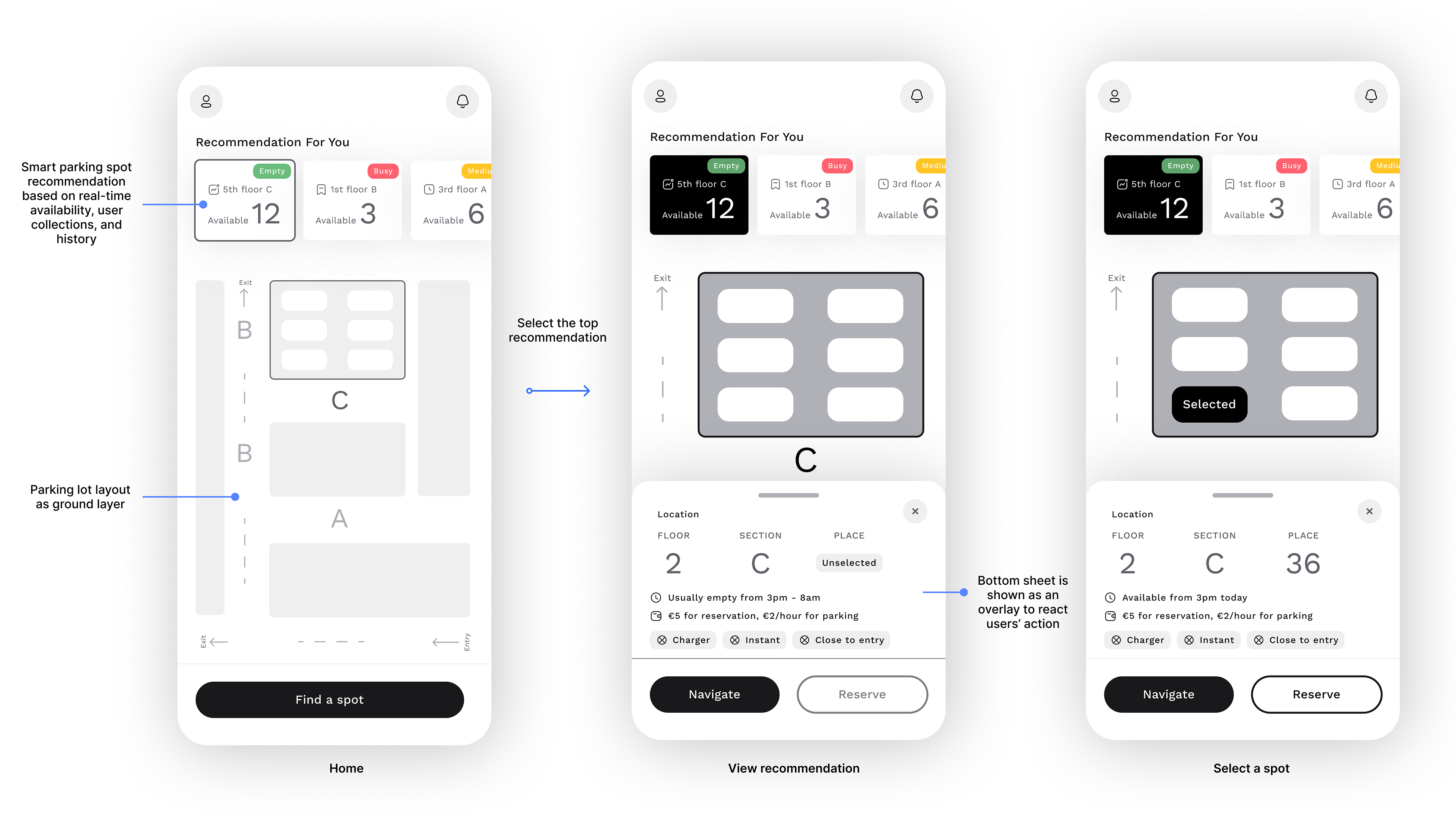
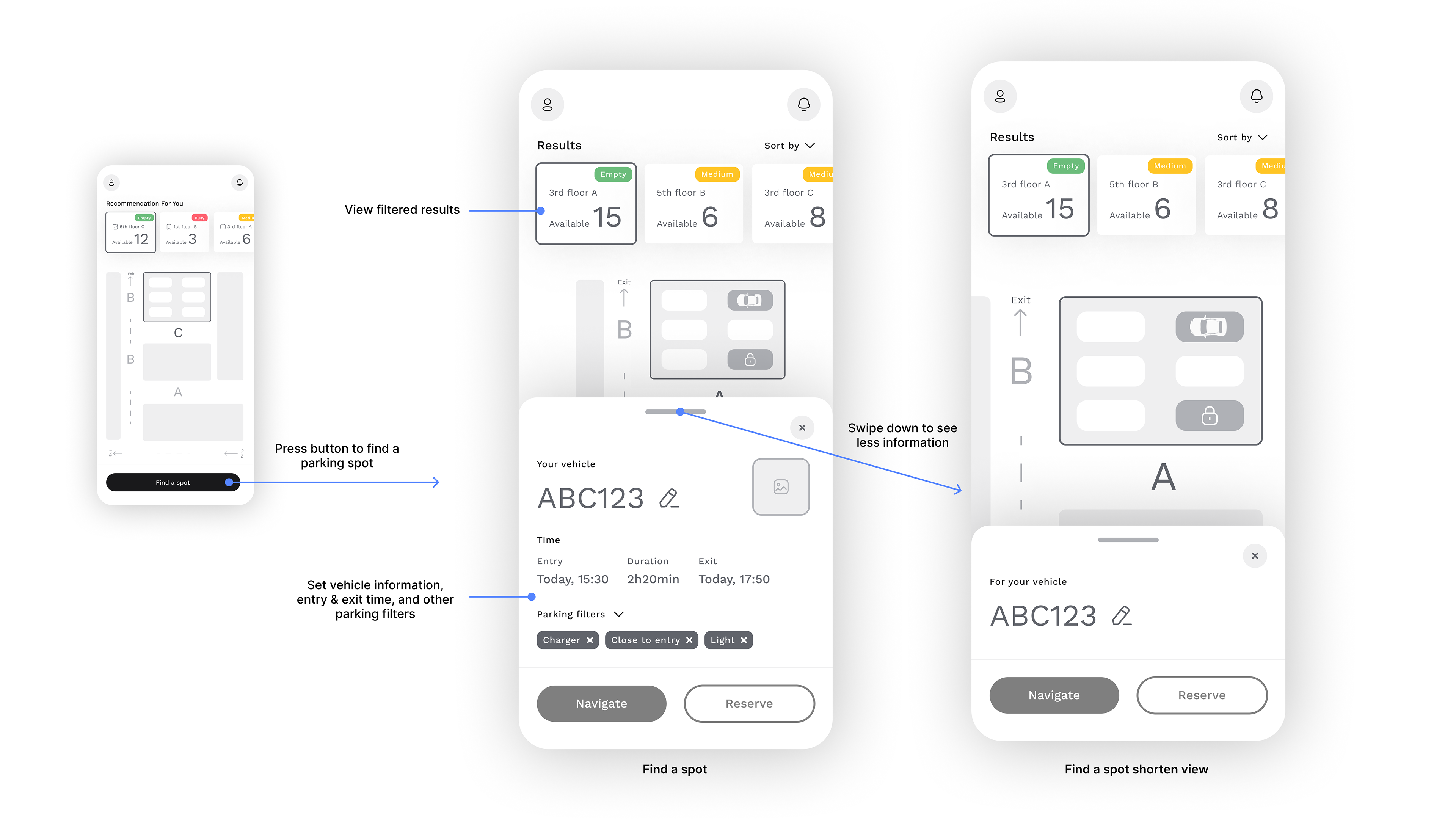
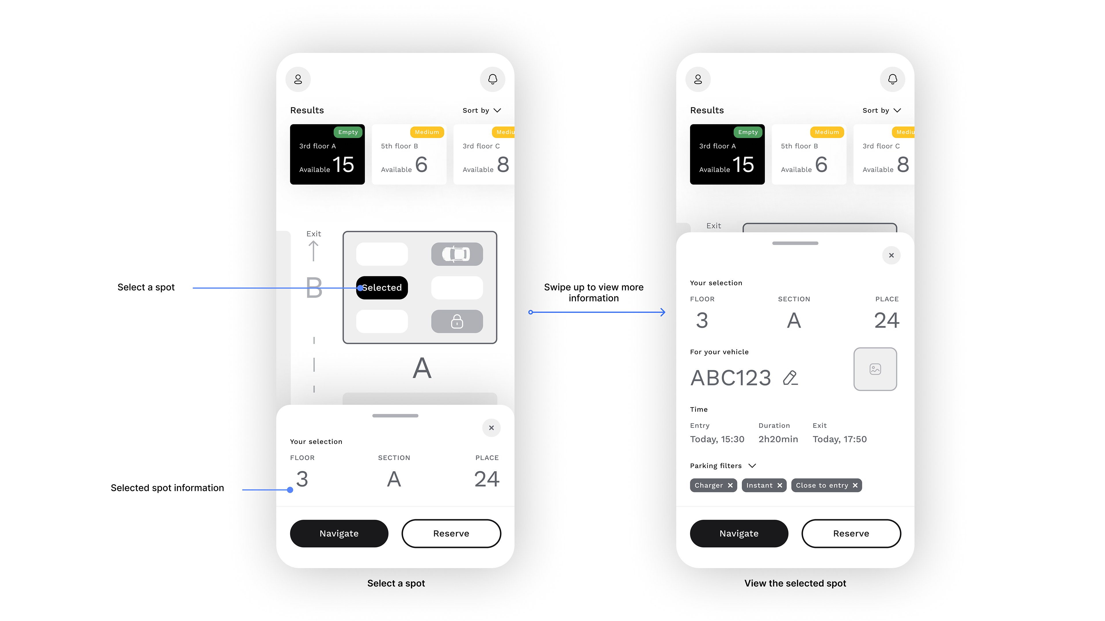
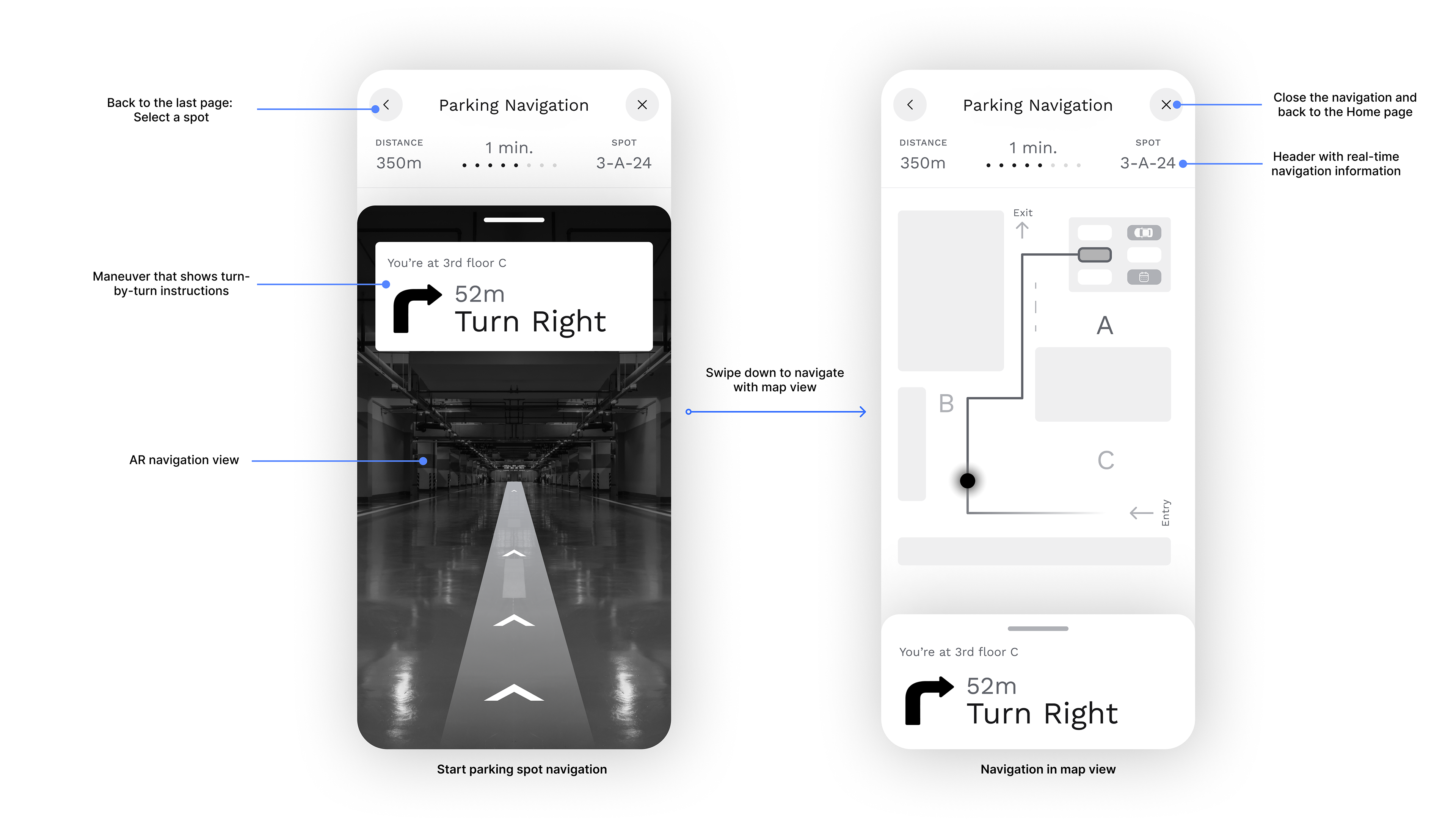
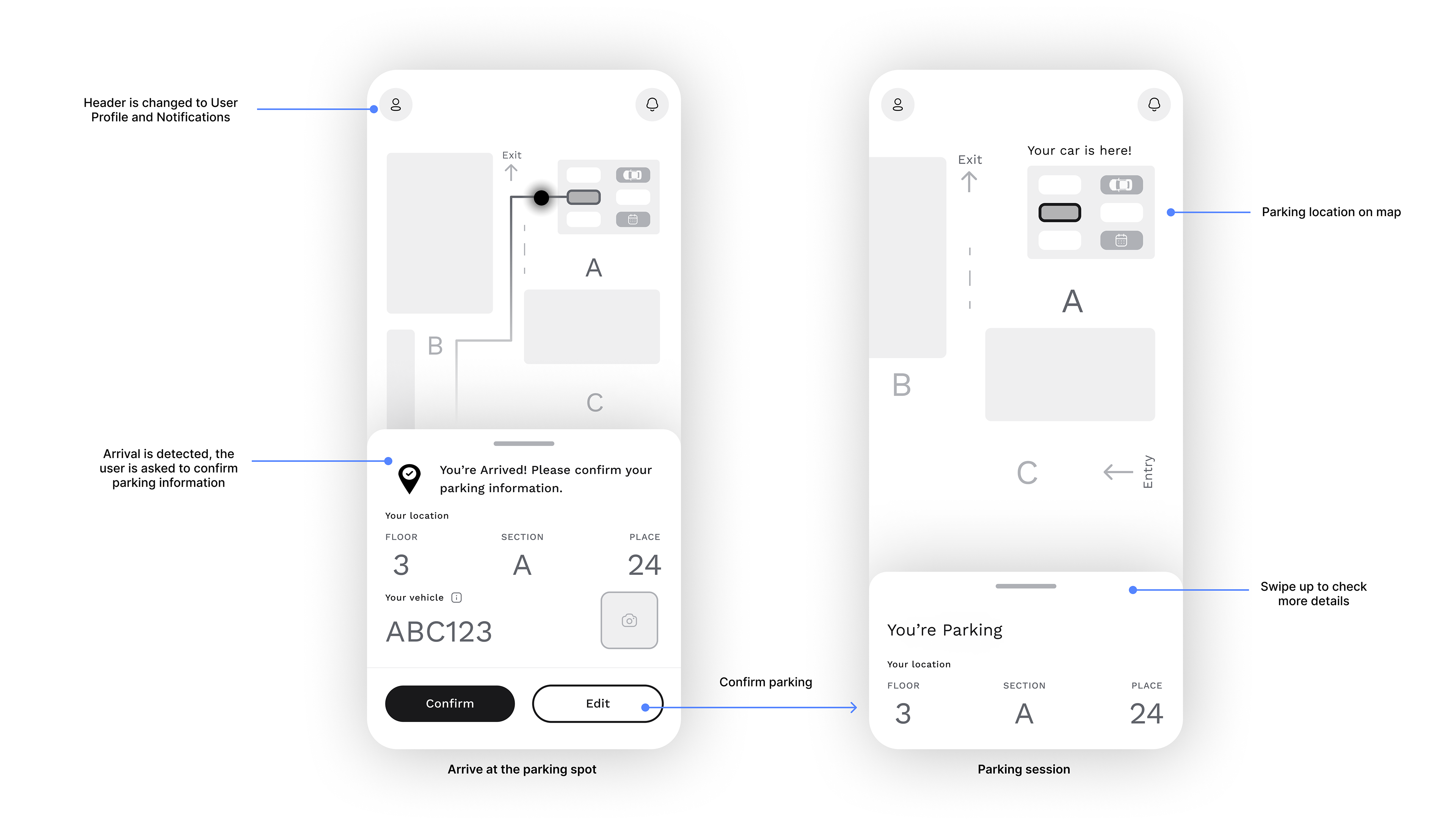
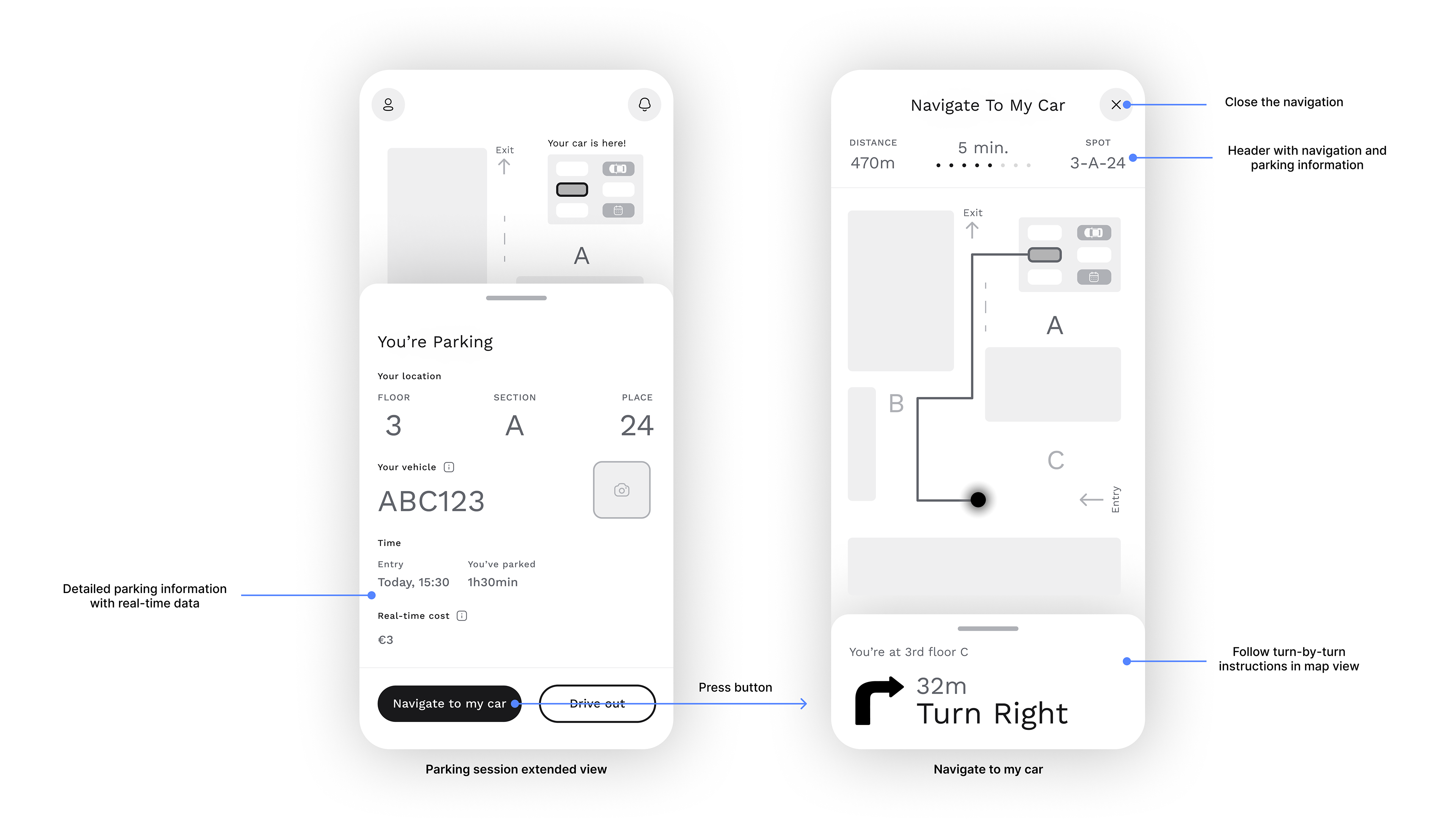
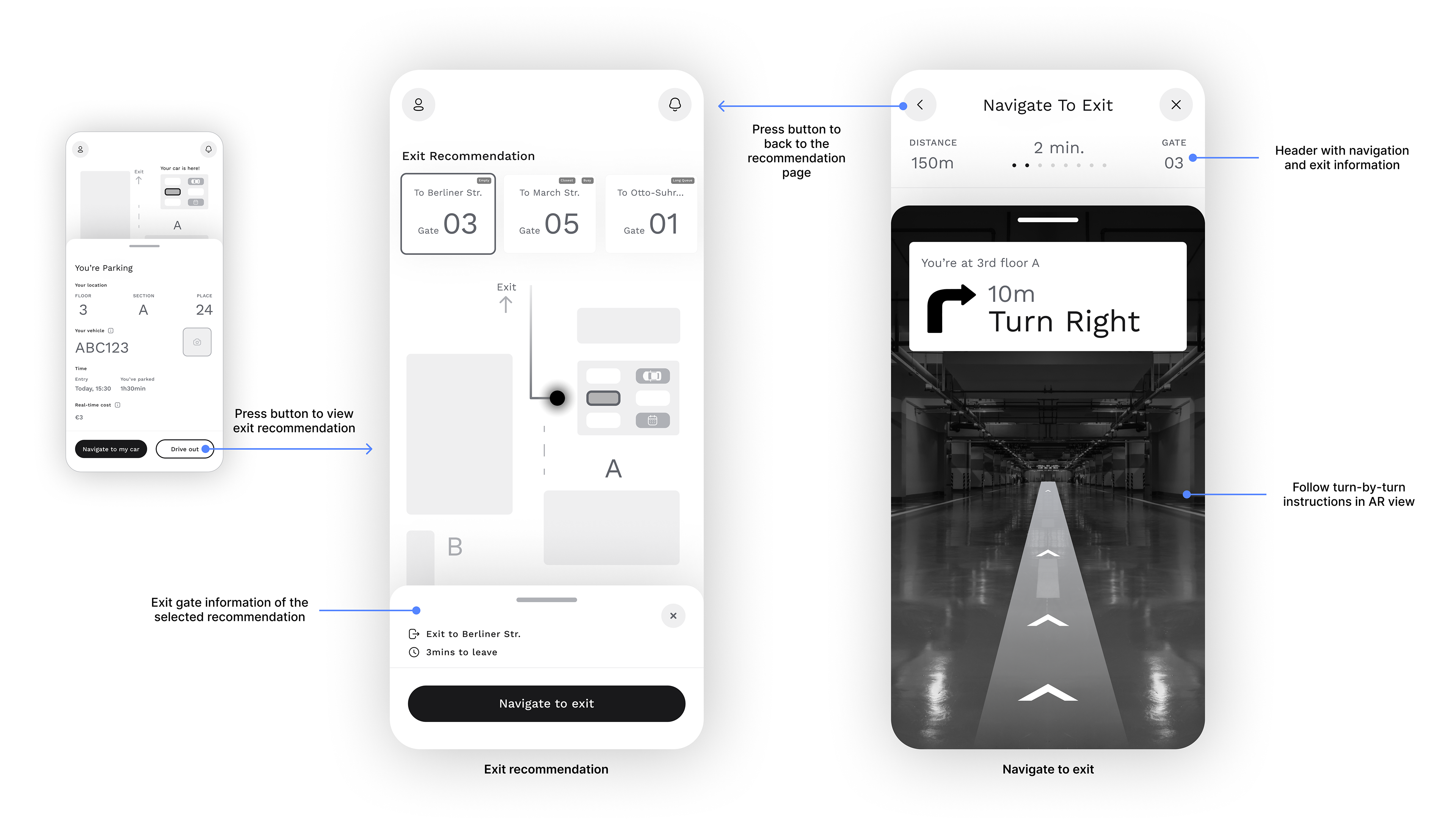
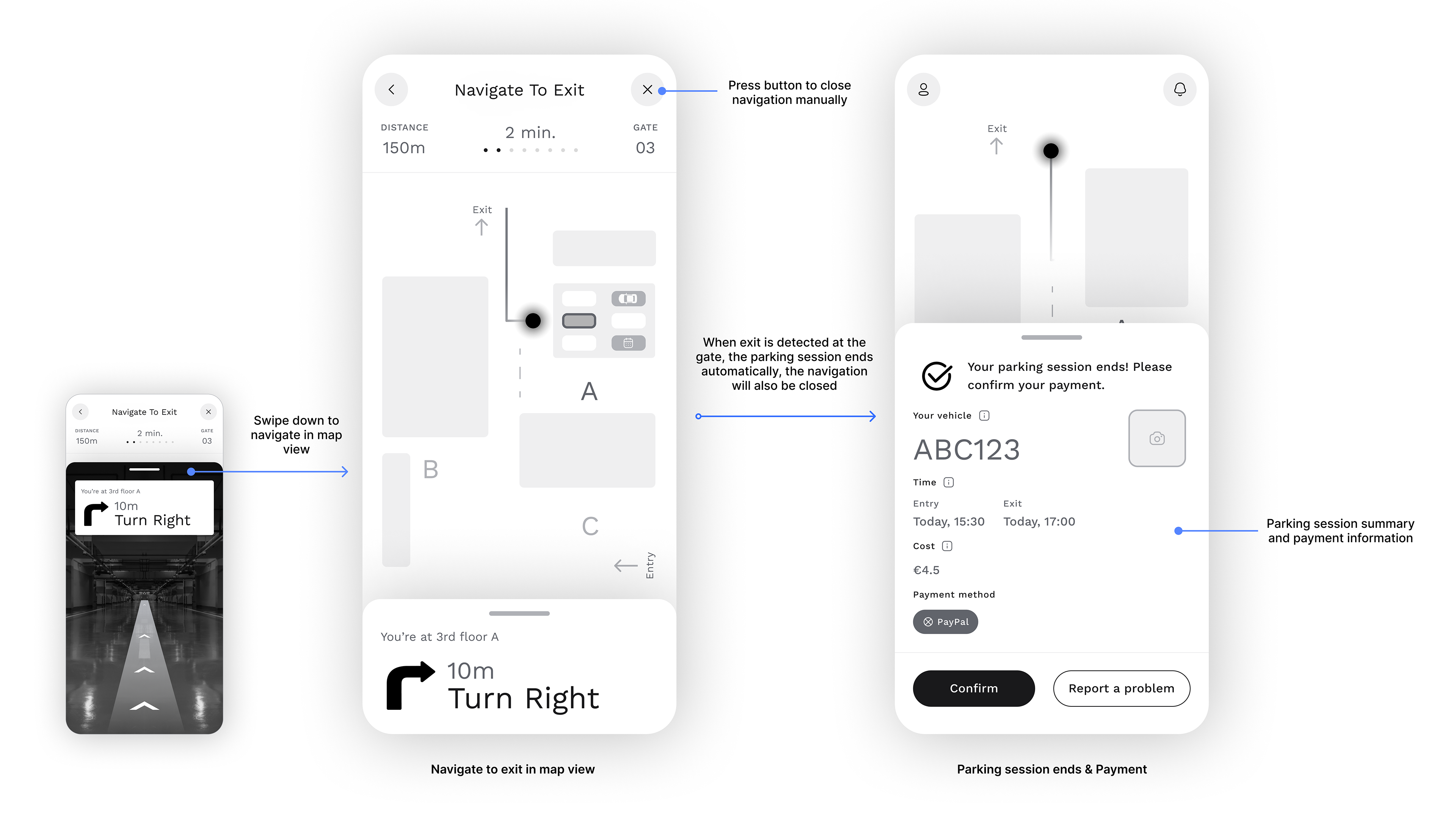
While I did not conduct usability testing within the timeframe, the structured approach ensured that the design decisions were grounded in user needs and real-world parking behaviors. The streamlined experience aimed to reduce the time spent searching for parking, minimize friction in the payment process, and enhance overall user satisfaction.
Reflections & Learnings
This challenge reinforced the value of strategic prioritization. Given the limited timeframe, I had to focus on essential scenarios and interactions, ensuring the solution was both feasible and impactful. Additionally, researching competitor apps highlighted the importance of balancing familiarity with innovation—leveraging existing user patterns while improving on common pain points. Lastly, simplifying the user interface was critical, especially since the app would often be used in high-stress situations such as driving.
Thanks you for reading :)