Project at a Glance
As a UX Concept Designer at the Volkswagen Group Future Center Europe, I collaborated with a cross-functional team to bring the power of Generative AI into the daily workflow of vehicle designers and marketing professionals. Our mission was to develop a web application that leverages Stable Diffusion—an advanced Generative AI model—to produce and modify automotive images quickly and intuitively.
What is Generative AI & Stable Diffusion?
Generative AI refers to algorithms that can create new content—such as images, text, or even 3D models—by learning patterns from large datasets. One cutting-edge tool in this domain is Stable Diffusion, an open-source image-generation model capable of producing high-quality visuals from text prompts or initial sketches.
Addressing the Pain Points
Automatic1111, a popular open-source interface available on GitHub, offers extensive Stable Diffusion capabilities. While highly capable, it also presents challenges for our target users.
Pain Points of Existing Frontends
🥴 Unintuitive and difficult-to-use interface
🛠️ Too power-user oriented, leading to a steep learning curve
🚗 Minimal tailoring for automotive design workflows
📈 Not streamlined for marketing-driven visuals
Our Goal
Our goal was to enable automotive designers and marketers to seamlessly integrate Generative AI into their daily workflows. We aimed to:
🚀 Replace Automatic1111 with an easy-to-use but still powerful web application for Stable Diffusion.
🧵 Streamline the user experience, ensuring even non-technical staff could generate and iterate on car visuals rapidly.
🎨 Provide a efficient, intuitive, and brand-aligned design for Volkswagen Group.
Team Setup
1*Project Manager
2*UX Designers (including me)
2*Frontend Developers
Stakeholders: Backend developers and technology experts from Volkswagen brand
My Responsibilities
As a UX designer, I was responsible for benchmarking, defining features, creating user flows, wireframing and prototyping, planning and conducting usability testing, design-to-development handover, writing the product manual, and maintaining the user community.
Design Process & Phases
From Kick-off to Rollout: Our UX Journey
The project followed an iterative design process, starting with a collaborative kick-off and progressing through research, feature definition, and mental model creation. These were followed by information architecture, task flows, and the development of wireframes and a cohesive design system. Prototypes were rigorously tested with stakeholders and users, leading to iterative refinements. The process culminated in development handoff, comprehensive documentation, and an MVP rollout, with ongoing iterations to refine the product further.
A Key Design Challenge: Designing an Edit Mode for Automotive Workflows
Edit Mode was a critical feature in this project, aimed at enabling automotive designers and marketers to refine and expand images with ease. The two core features of Edit Mode, Inpainting and Outpainting, allowed users to modify specific areas of an image or extend its boundaries to create new content. However, the initial interface inherited from Automatic1111 was overly technical and posed significant usability challenges. By analyzing user workflows, conducting extensive research, and iterating on designs, we transformed these complex capabilities into an intuitive and accessible tool tailored to the needs of our audience.
Understanding Inpainting & Outpainting
Inpainting: Filling or modifying a specific masked area within an existing image.
Outpainting: Extending the boundaries of an image, creating new content beyond the original canvas.
Main Challenges
• 🎨 Defining and translating the mental model of Edit Mode into clear design patterns
• 🧩 Balancing power-user needs vs. accessibility for vehicle designers
• ✍️ Naming functions & settings in a universal, easy-to-understand way
• ⚙️ Addressing technical ‘black boxes’ while keeping the experience smooth
Research
• 📊 Benchmarking competitors ( Invoke AI, Playground, DreamStudio, Adobe Firefly, DALL-E, Midjourney) to see how they handle inpainting/outpainting.
• 🔧 Technical constraints exploration: Understanding what Automatic1111 does well (or poorly) for inpainting/outpainting.
User Flow Creation
• 🔄 Executed the full workflow on the backend to grasp real-world steps.
• 🗂️ Reorganized the flow and consolidated info into our own product’s user flow.
• 🤝 Frequent developer check-ins to ensure feasibility.
• 📅 Weekly stakeholder reviews to align with user expectations.
Mental Model: Two Proposals
Two proposals were developed for the Edit Mode design during a collaborative brainstorming session. By combining insights from user research and technical possibilities, we crafted each option to ensure a smooth and intuitive experience while addressing user pain points and balancing technical constraints.
Proposal A - Focusing on Contextual Simplicity with Relevant Settings in the Left Side Bar
1️⃣ Edit Mode accessed via Tabs in the left side bar.
2️⃣ All setting items stay in the left pane, but only Edit Mode relevant settings appear.
3️⃣ The prompt describing the mask area is in a “Generate” popup.
4️⃣ Switch between Inpainting and Outpainting via the toolbar on the top.
Proposal B - Prioritizing Flexibility by Integrating Settings into the Bottom Pane
1️⃣ The setting items in the left pane remain mostly unchanged in Edit Mode, but irrelevant items are grayed out.
2️⃣ Edit Mode contextual settings appear in the bottom pane.
3️⃣ The prompt describing the mask area is in the bottom pane.
3️⃣ Switch between Inpainting and Outpainting via the toolbar on the top
User Testing
Methodology
1. Task-based testing using a within-subjects design (each participant tries both Proposal A and B).
2. Think-aloud protocol during tasks.
3. Post-tasks interview session
Participants
1 UX Concept Designer
2 Vehicle Designers (1 interior designer, 1 exterior designer)
1 Service Designer
Tools & Environment
• Figma (click dummy prototypes)
• FigJam for protocol and note-taking
• 1-hour online session per participant (facilitator + note taker)
• Process: Warm-up → Tasks with Version A & B in random order → Alternative Design Exploration → Wrap-up
Data analysis
With the feedback from user testing, we went into a data analysis session to summarise the takeaways.
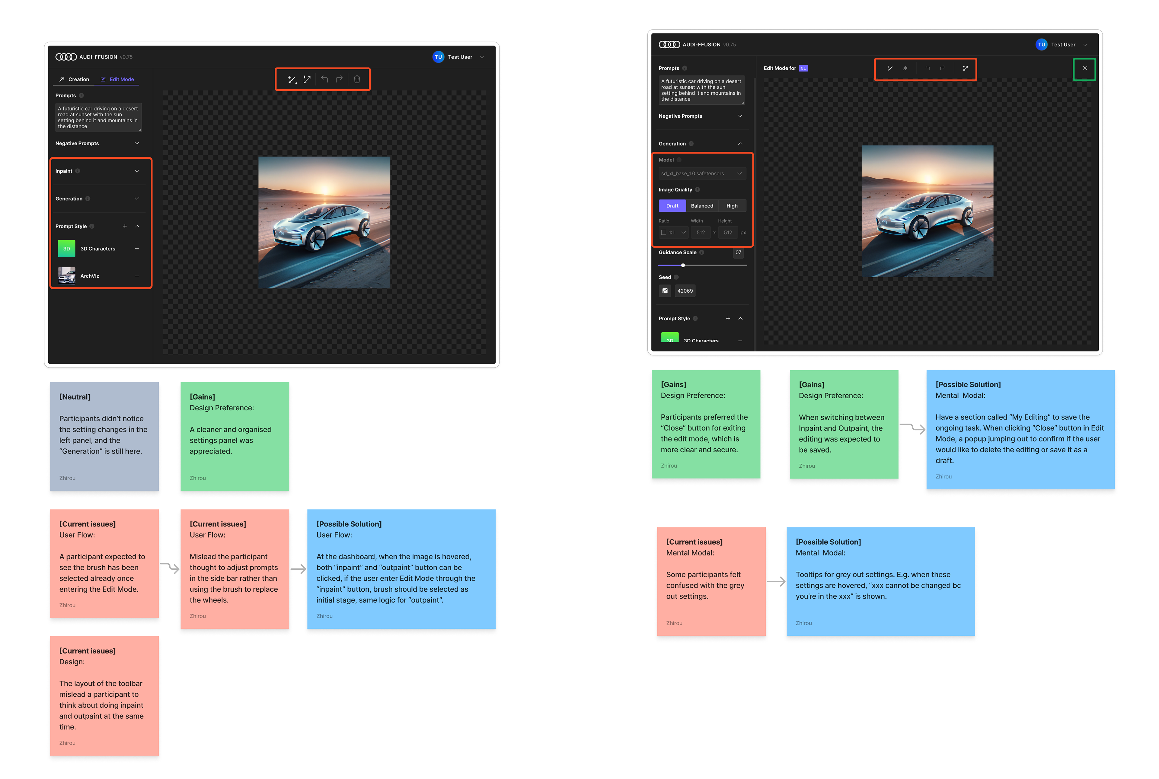
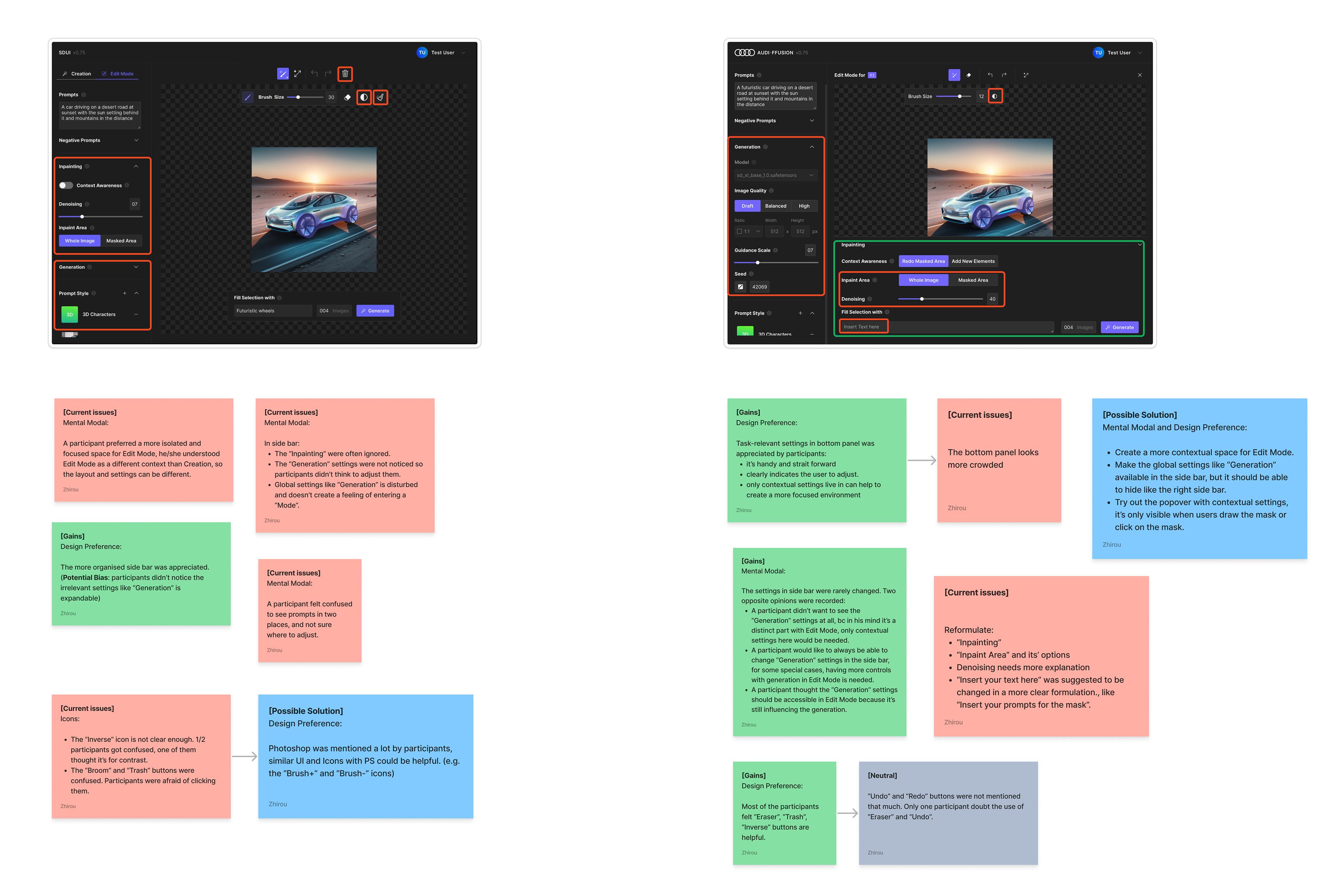
The Process Involved the Following Steps:
1. Extract key observations → Identify patterns
2. Categorize patterns into User flow, Interaction behavior, Formulation, Mental model, Visual representation, Design patterns
3. Tag as Current issues, Gains, Possible solutions, or Neutral
4. Reflect on screens → Summarize the problems and good points
5. Generate solutions for identified problems
Design Decisions & Iterations
We consolidated and condensed all the thoughts and came up with solutions to the results, which we summarized in the data analysis step. Here are the iterative designs that were delivered:
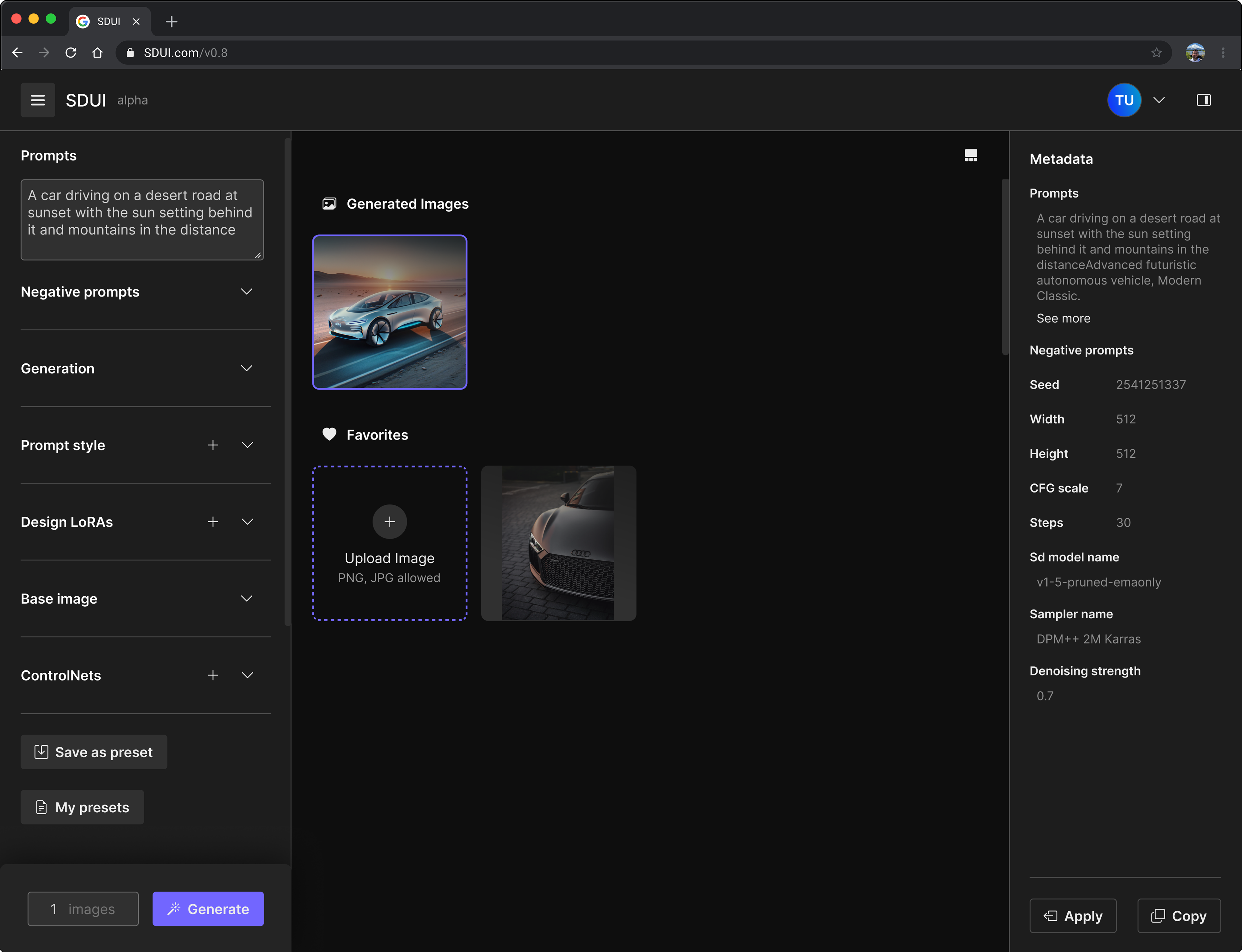
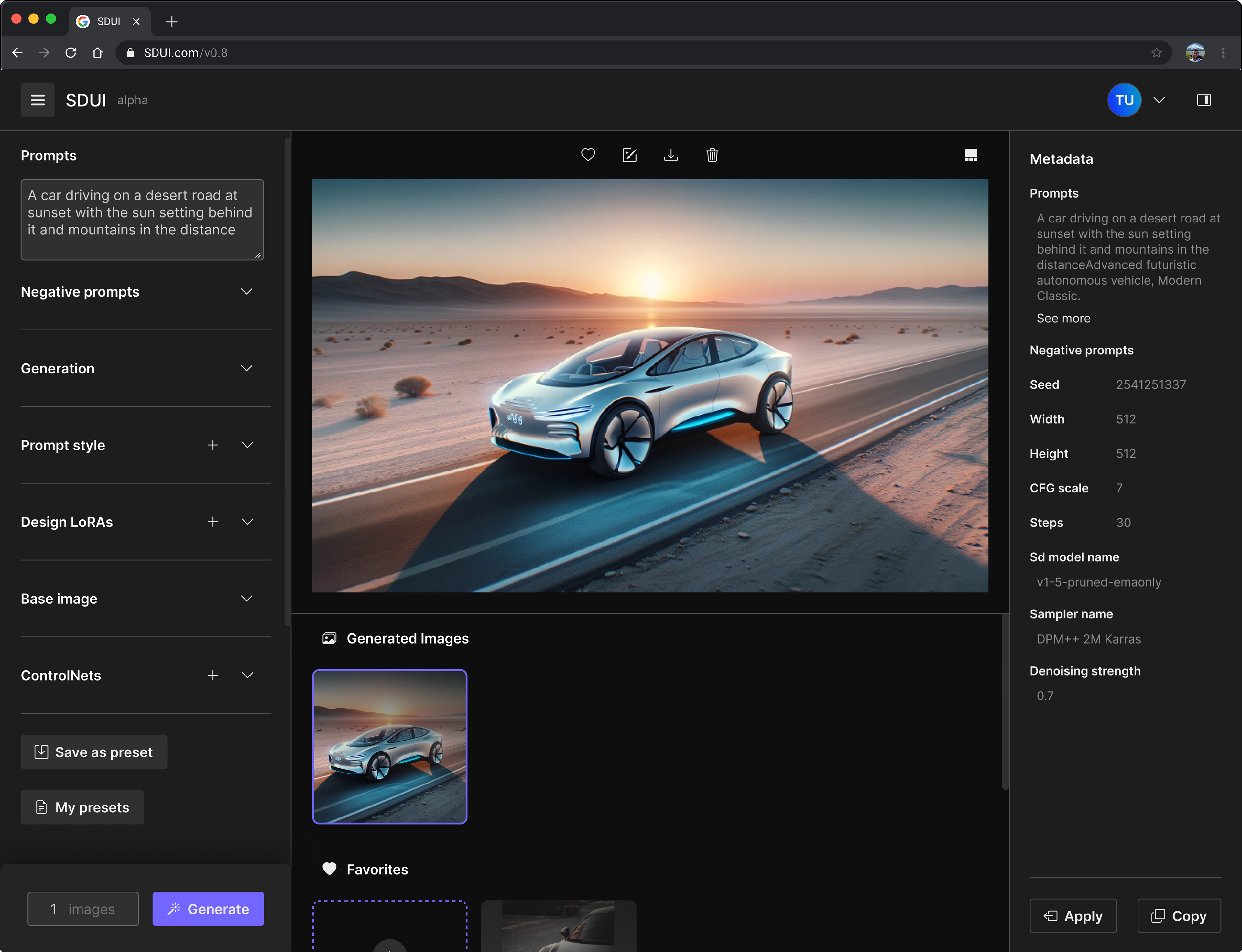
Dashboard👇
Results:
• Participants expected to see an enlarged view of images on the dashboard when they clicked on them. And they'd like to be able to upload local images directly to the dashboard.
Solutions:
• Provide the stage view on the dashboard, users can switch back to the grid view by clicking on the "View" button.
• Provide the access to upload local images under the "Favorites" section.
Edit mode👇
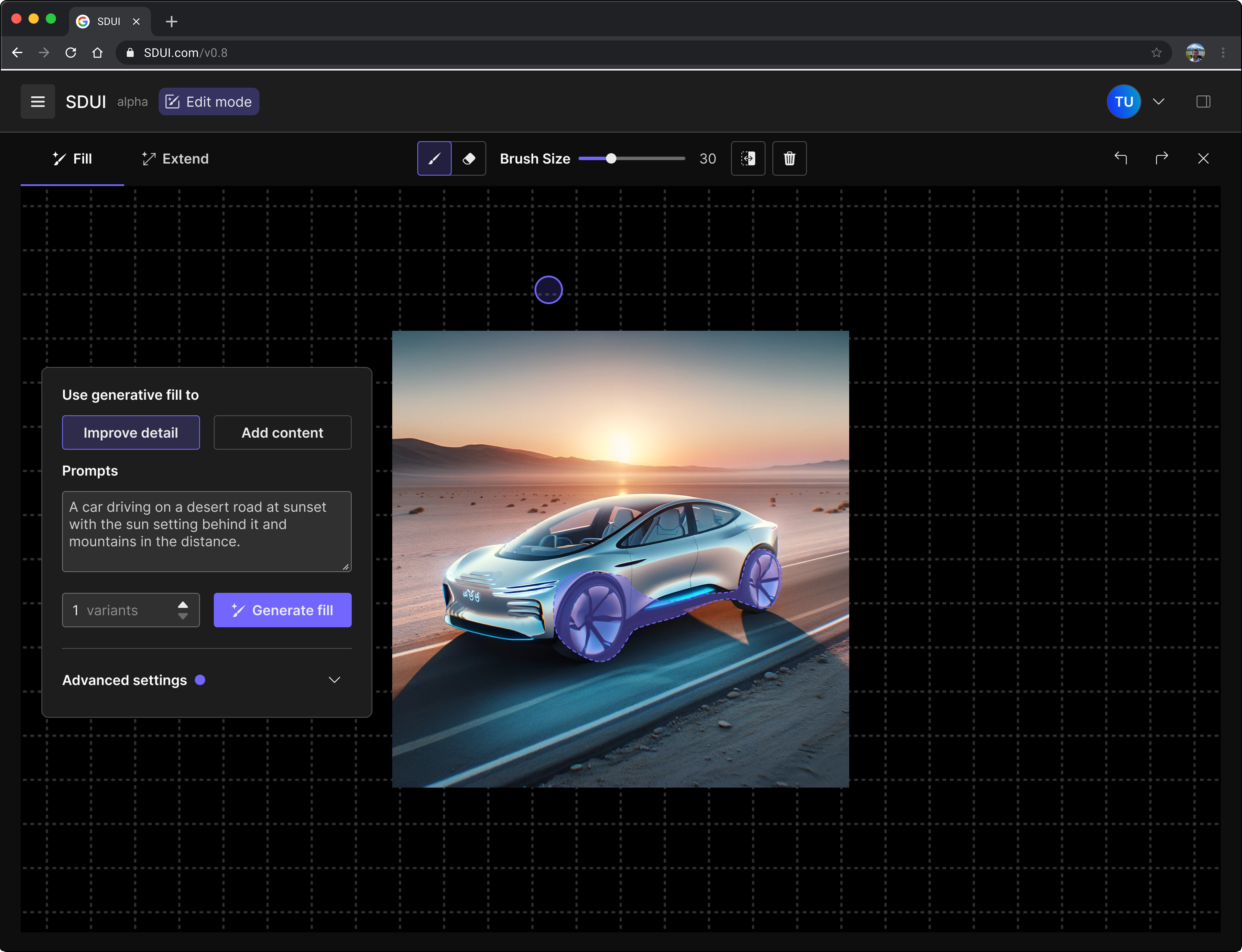
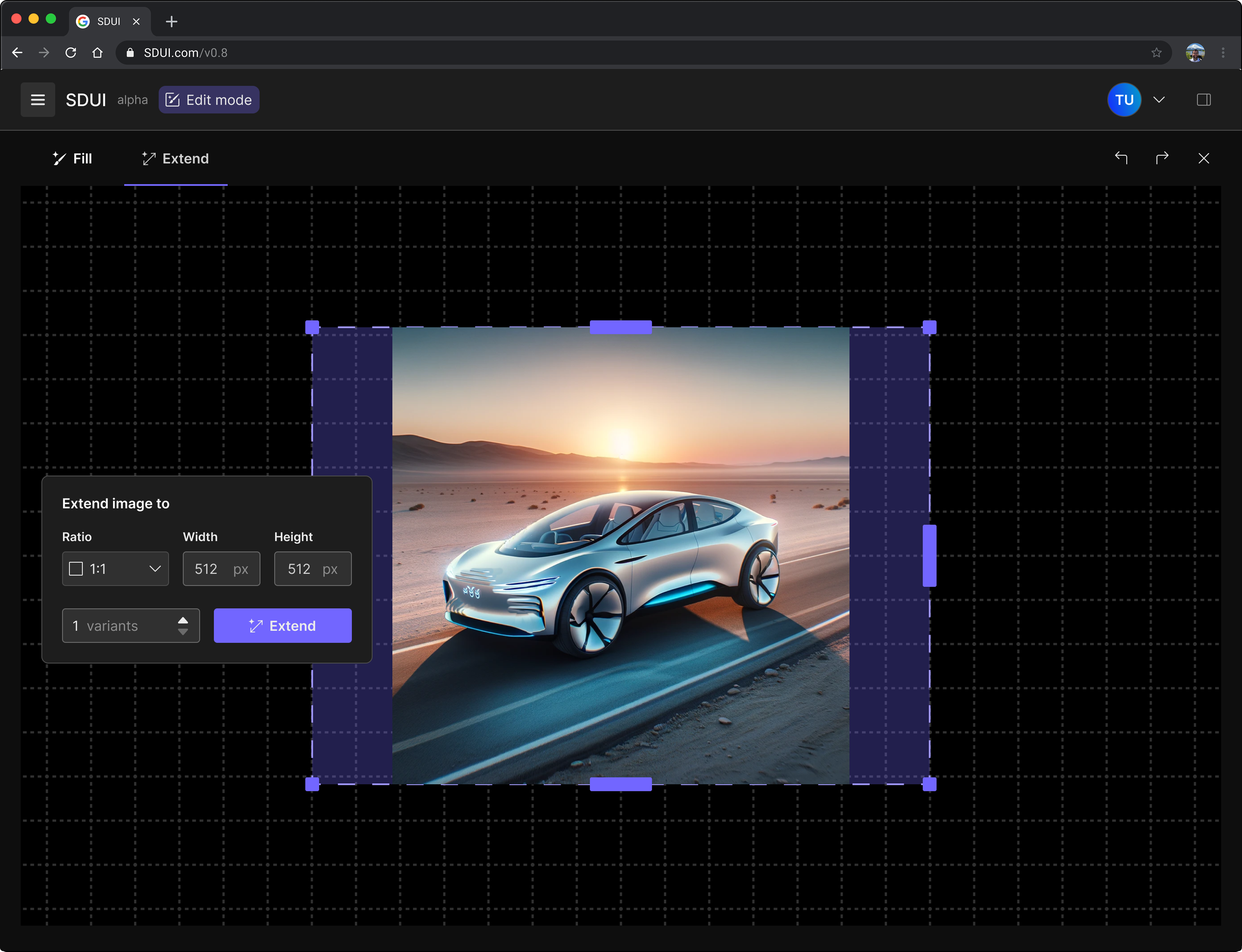
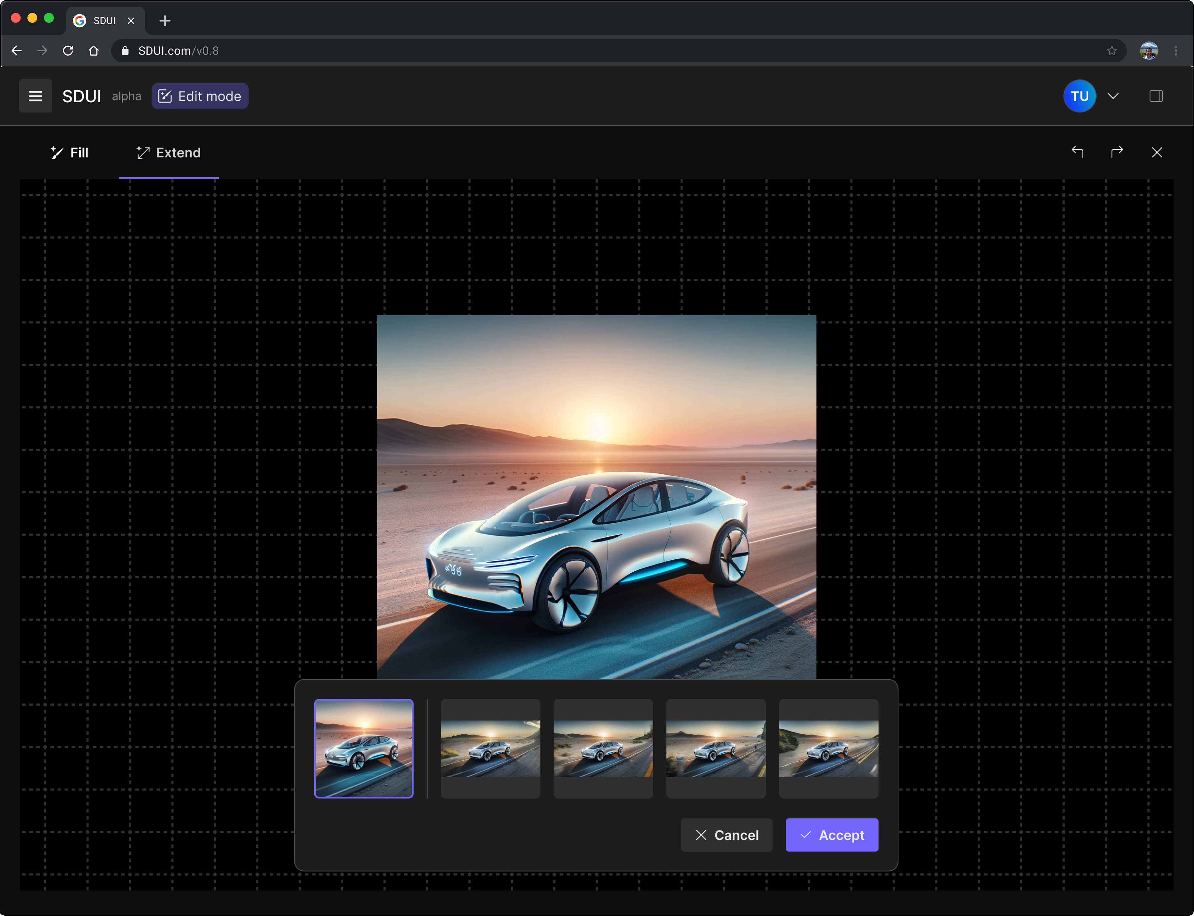
Results - Mental modal:
• Participants were confused by the term "Inpainting" and "Outpainting", expecting a more straightforward name for the features.
• Participants appreciated cleaner and more focused space of Edit Mode, which they perceived as a separate area from the Dashboard.
• Participants felt confused and unsure if they can do generative fill and extend tasks at the same time.
Solutions - Mental modal:
• Rename the features "Inpainting" and "Outpainting" as "Fill" and "Extend".
• Adopt a no-Tab design in the side bar.
• Make the side bar foldable to make the layout in Edit Mode more focused.
• Use dedicated tabs only for Fill vs. Extend.
Results - Edit mode settings:
• Participants often ignored changes in the side bar. They preferred adjusting relevant settings within the canvas area.
• Participants expected visual similarity between the Fill area and Extend area to indicate which area will be changed.
Solutions - Edit mode settings:
• Show Edit Mode settings in a popup, and collapse the side bar by default.
• For Extend, use drag handles that allow the user to adjust the extended area of the image.
• For Extend, use the same visual patterns as for Fill to highlight the extended area.
• For Extend, use the same visual patterns as for Fill to highlight the extended area.
Results - Generate images:
• Participants wanted easy access to the original image after generating variants.
Solutions - Generate images:
• Show the original image in the generated images popup, enabling quick reference.
Color Scheme
Image editing tools demand a well-defined color scheme to maintain contrast and hierarchy, which is why our iteration extended beyond the mental model to refine the color scheme as well.
We refined the color scheme in our design system, drawing inspiration from Adobe's Spectrum design system to align with industry standards and ensure user familiarity. By structuring the interface into distinct layers with color tones reinforcing hierarchy, we improved readability and contrast. Earlier designs suffered from low contrast, making the interface unclear. The updated version provides a clearer distinction between layers, particularly in Edit Mode, creating a more focused and immersive experience.
Design Handover
In this project, design and development were built on different design systems, requiring careful coordination to ensure consistency. The design system was largely customized based on Adobe Spectrum guidelines, while development utilized the Skeleton UI Toolkit with Svelte and Tailwind. With design work running approximately four weeks ahead of development, our process needed to bridge the gap between these systems efficiently.
What Worked Well
1. Balanced approach: We established a method compatible for both designers and developers.
2. Timely synchronization: We had regular design-development reviews kept everyone aligned.
3. Design decision record: Every design decision was recorded to reduce unnecessary back-and-forth by documenting key decisions.
Areas for Improvement
1. Design system inconsistencies: Close gaps between design and final frontend implementation.
2. Handover inefficiencies: Handover relied too much on verbal explanations and manual interpretation slowed down the process, a more efficient workflow is needed.
Conclusion
This project demonstrated how Generative AI can streamline automotive design workflows and improve efficiency. Through research, iteration, and collaboration, we transformed complex AI capabilities into an intuitive tool for designers and marketers. While challenges like design-development consistency remain, the project successfully laid the groundwork for integrating AI into creative processes. The insights gained will help refine future iterations and enhance usability for industry professionals.
Thank you for reading:)