Overview
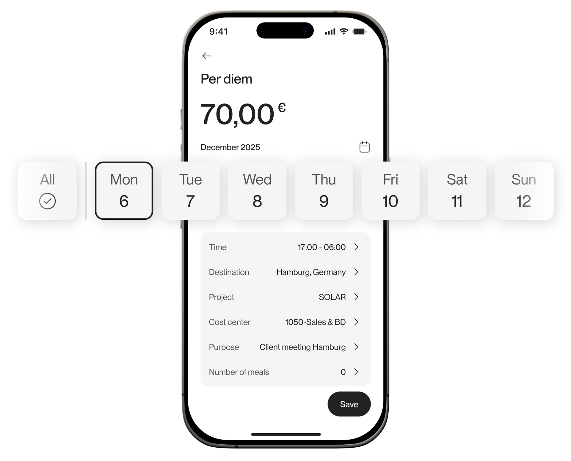
Daily Trips lets employees who travel for work on several days a month, for example to visit clients in another city, claim allowances for all those days in one submission. The feature launched on web first. My task was to bring it to iOS and Android with the same functionality.
I treated it as a design problem rather than a format transfer. The web table didn't fit a phone, and mobile users are in different situations, so the mobile version should bring its own value.
Design challenge
The web version is built for a desk. Days are rows, fields are columns, and users edit everything in one dense table. That works on a large screen, where people scan and compare many days at once.
On a phone, a table breaks. Columns don't fit, horizontal scrolling hides information, and editing small cells is error-prone.
The usual approach wasn't enough either. At Circula, desktop tables are usually turned into lists on mobile. For Daily Trips, with several days and several fields per day, that would create a long, repetitive screen.
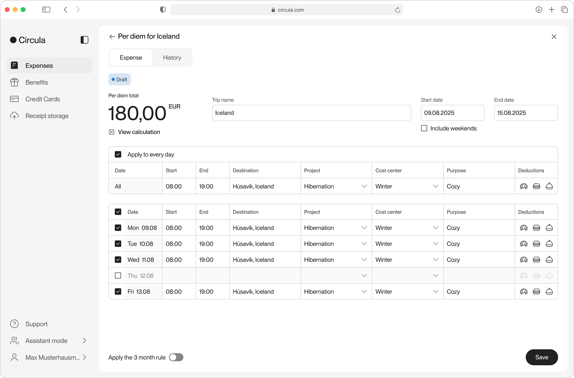
Daily Trips web version
Most importantly, different platforms serve different situations. On web, users report many days at once at their desk. On mobile, they want to log trips quickly, in short moments, with as little typing as possible.
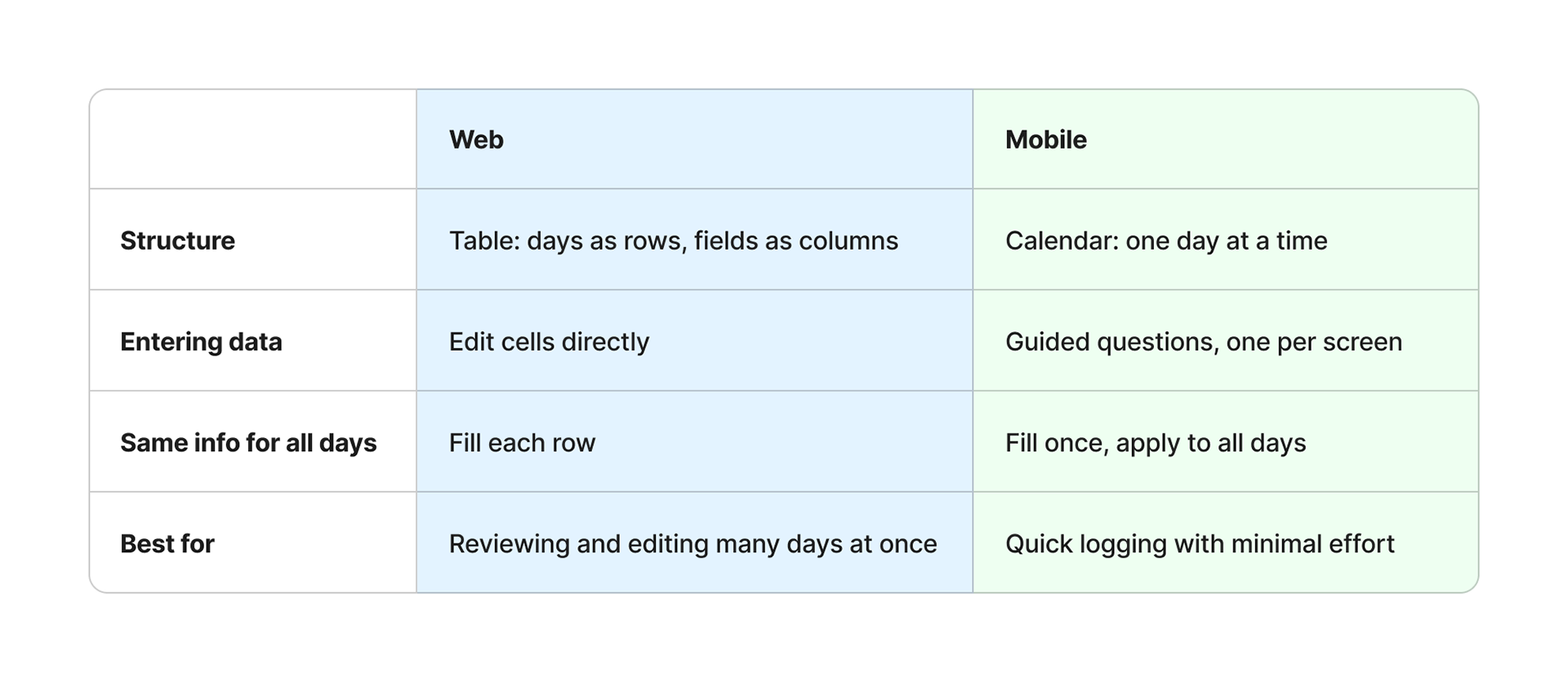
The table below illustrates the differences between web and mobile in several areas:
The table below illustrates the differences between web and mobile in several areas:
Design approach
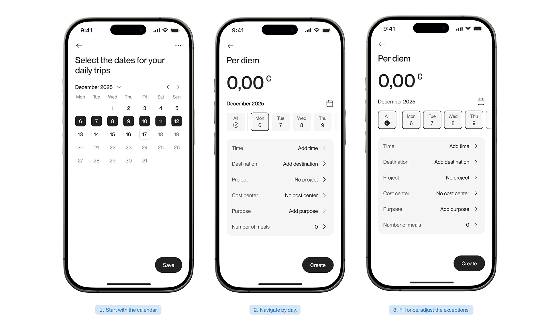
I took inspiration from travel booking apps and defined three principles:
Start with the calendar.
Users set up the general information and pick their travel days first. Everything else builds on those dates.
Navigate by day.
A week strip becomes the navigation: tap a day to view or edit it. The total allowance stays visible at the top and updates as days are completed.
Fill once, adjust the exceptions.
Most day trips repeat: same destination, same times, same project. Users enter shared information once for all days, then change only the days that differ.
Testing and iteration
I ran three rounds of testing, each focused on the open questions from the previous one.
Round 1: list view vs calendar view (onsite, 10 testers)
Tested whether users understand calendar navigation, compared with Circula's conventional list view.
Round 2: calendar navigation with an "All" tab (online, 5 testers)
⏺ Testers naturally used the day tabs to view and edit individual days.
⏺ 4/5 testers found "All" tab clear.
⏺ Most testers skipped the empty state text and expected to land on the first day
Decisions
⏺ Calendar navigation over the list view: it fits mobile better and gives users a clearer space to fill in each day, with no major friction found
⏺ A dedicated "All" tab, separate from day navigation
⏺ Land directly on the first day instead of an empty state
Deliver
With the key decisions validated, I moved into final design and handover.
⏺ Final designs for iOS and Android, following each platform's conventions
⏺ Edge cases covered: a single day, overnight stays, selection across months, the 3-month rule, custom attributes, trips without per diem, error states and submitted trips
⏺ Supported development and QA for both apps
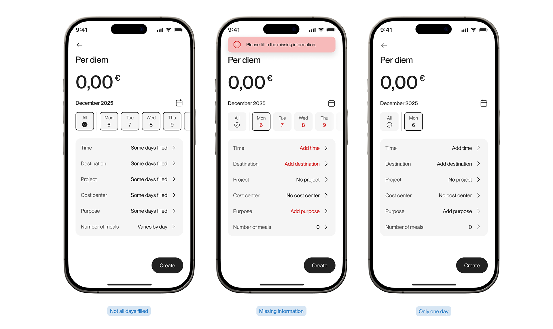
Some edge cases
Impact
Daily Trips is the only expense type where more submissions come from mobile than from web. Features with the same functionality on both platforms usually lean towards web. For Daily Trips, users chose mobile. And looking at the trend over time, they're choosing it more.
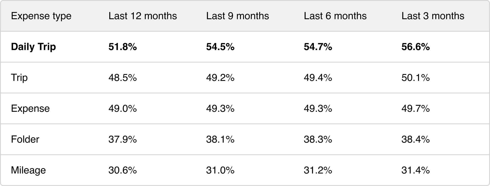
Share of submissions made on mobile, as of September 2026.
Over the past year, Daily Trips' mobile share rose by almost 5 percentage points, while every other expense type moved by less than 2. Users aren't just able to log day trips on their phones, they increasingly prefer to.