Overview
Circula customers constantly complaining about one switch toggle "Expense is reimbursable" turned out to be a symptom of two system-level gaps. I split the work into three tracks, shipped the urgent one first, and used the other two to close those gaps in the design system.
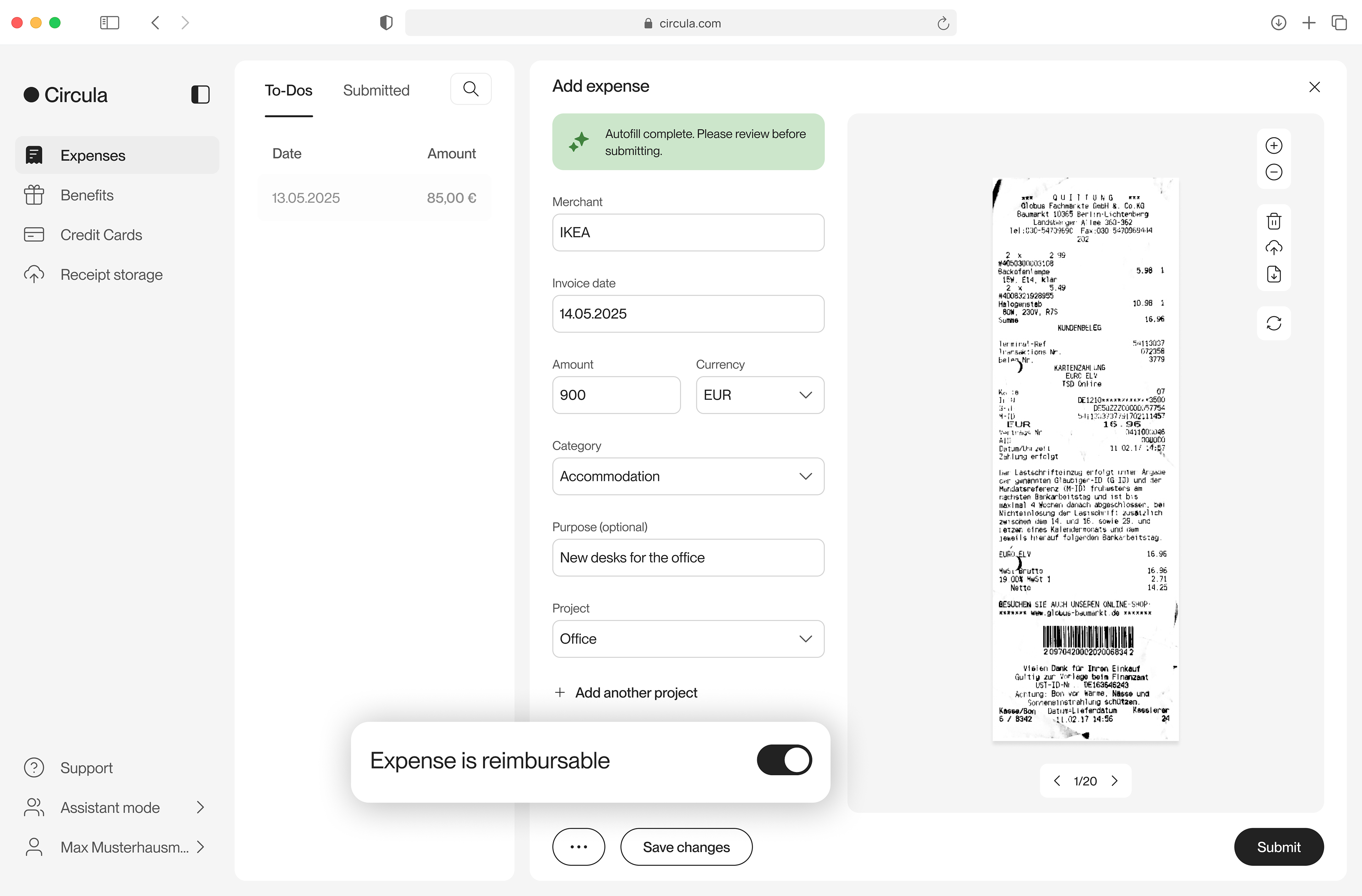
(Old) Circula web app “Expense is reimbursable" field in submitter view
Discover: why do customers keep complaining about one small field?
Circula's expense form had a single switch labelled "Expense is reimbursable". Customer feedback kept returning to it with the same three complaints:
1. Submitters turned it off by accident
2. Nobody noticed until finance did
3. Supervisors could not tell an expense's status during review
Dive into the compliant
● I clustered complaints from 20+ customer support notes
● I checked the product data: 89% of non-card expenses are reimbursable, and card expenses default to non-reimbursable. So "No" is the rare case, and the costly one.
● I traced 5 internal cases: I found the five non-reimbursable expenses submitted inside Circula in the past year and interviewed the submitters. All five were unintended, and none of the submitters had noticed until I pointed it out.
● I conducted 2 accountant interviews on how they handle the "Expense is reimbursable" field during review.
➡️ The complaints pointed to three problems: the field was hard to notice, easy to change by accident, and hard to read in review.
Define the problem
Inspection
4 methods helped me to inspect the root problem:
● UX critique: the whole switch row was the touch target, and a dropdown above could open over it. It's too easy to be changed accidentally without notice.
● Mental model check: a switch usually promises instant effect, but this form only saves on "Submit".
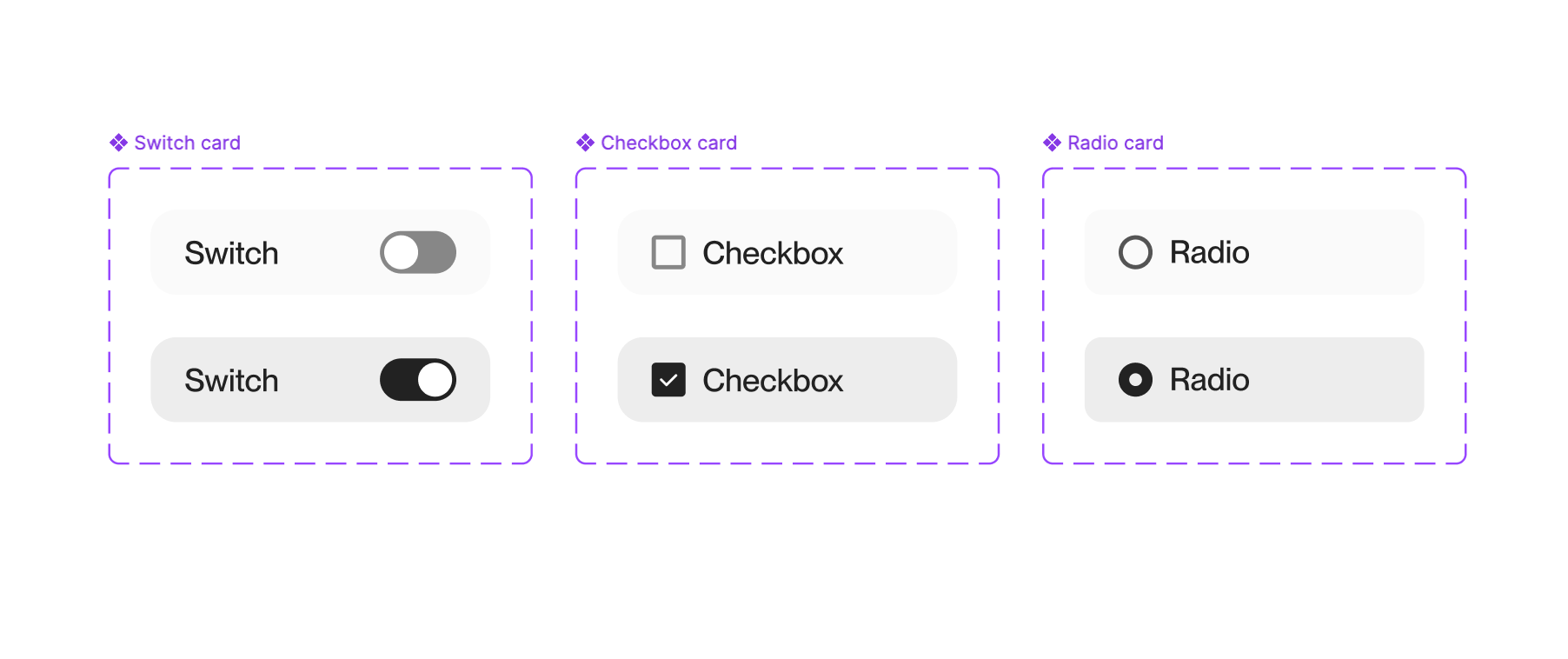
● Component audit of every checkbox, switch and radio across the web app.
● Desk research on binary choice conventions in Carbon, Cloudscape and other design systems.
Two findings that changed the scope
1. The three binary choice components were used interchangeably. Circula was missing a standard on how to use the three binary choice components: Switch, Checkbox, and Yes/No radio. Switches appeared in long submission forms where nothing saves until "Submit", in notification settings behind a "Save" button, and in admin settings where changes apply instantly. Same component, three different promises. Several labels were also phrased as questions ("Is the trip outside of Germany?") or negatives ("Per diem should not be paid"), which makes a binary state harder to read.
2. The design system had no read-only state. Review screens reused the disabled state instead. Disabled-on and disabled-off share the same muted look and differ only by knob position, which is exactly what supervisors struggled with. Part of the complaint came from a missing state, not a missing style.
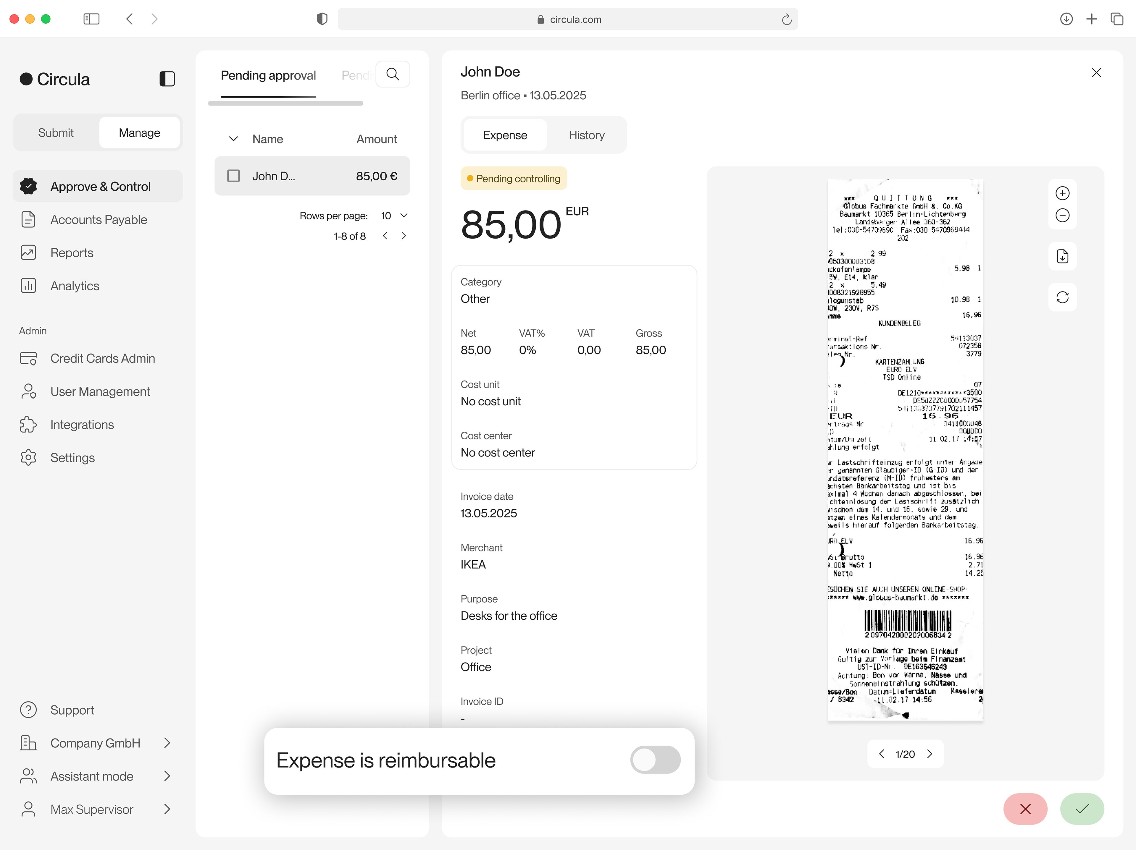
(Old) Circula web app “Expense is reimbursable" field in supervisor view
Scoping decision: one complaint, three tracks
The problem was bigger than one field. I split the work into three tracks and sequenced them by urgency and dependency.
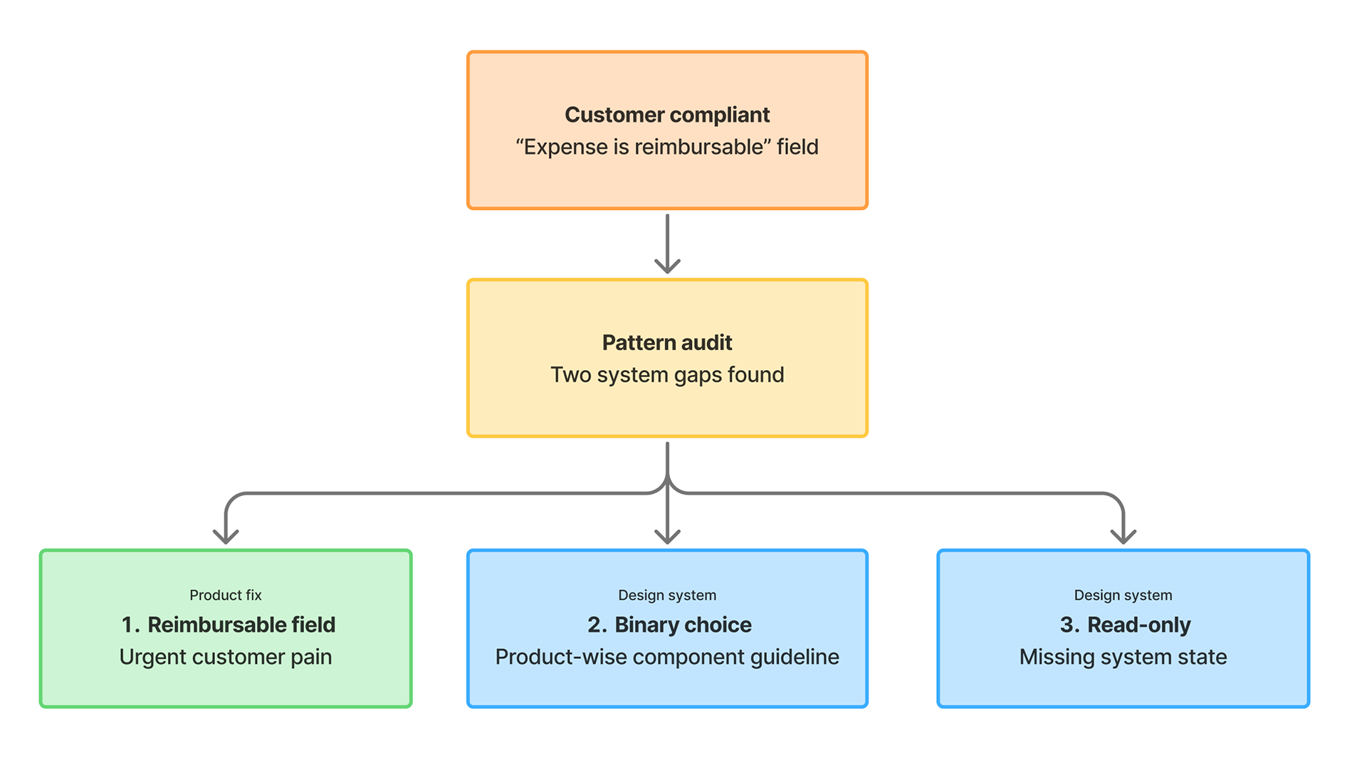
From one compliant to three tracks
Develop: designing and validating each track
Track 1: "Expense is reimbursable" field
To solve the urgent customer complaint directly, I proposed a solution which has now been implemented: Replace the switch toggle with a Yes/No radio: using a question label with explicit text, making it harder to change by accident. On review screens, show the value as static text instead of a disabled control.
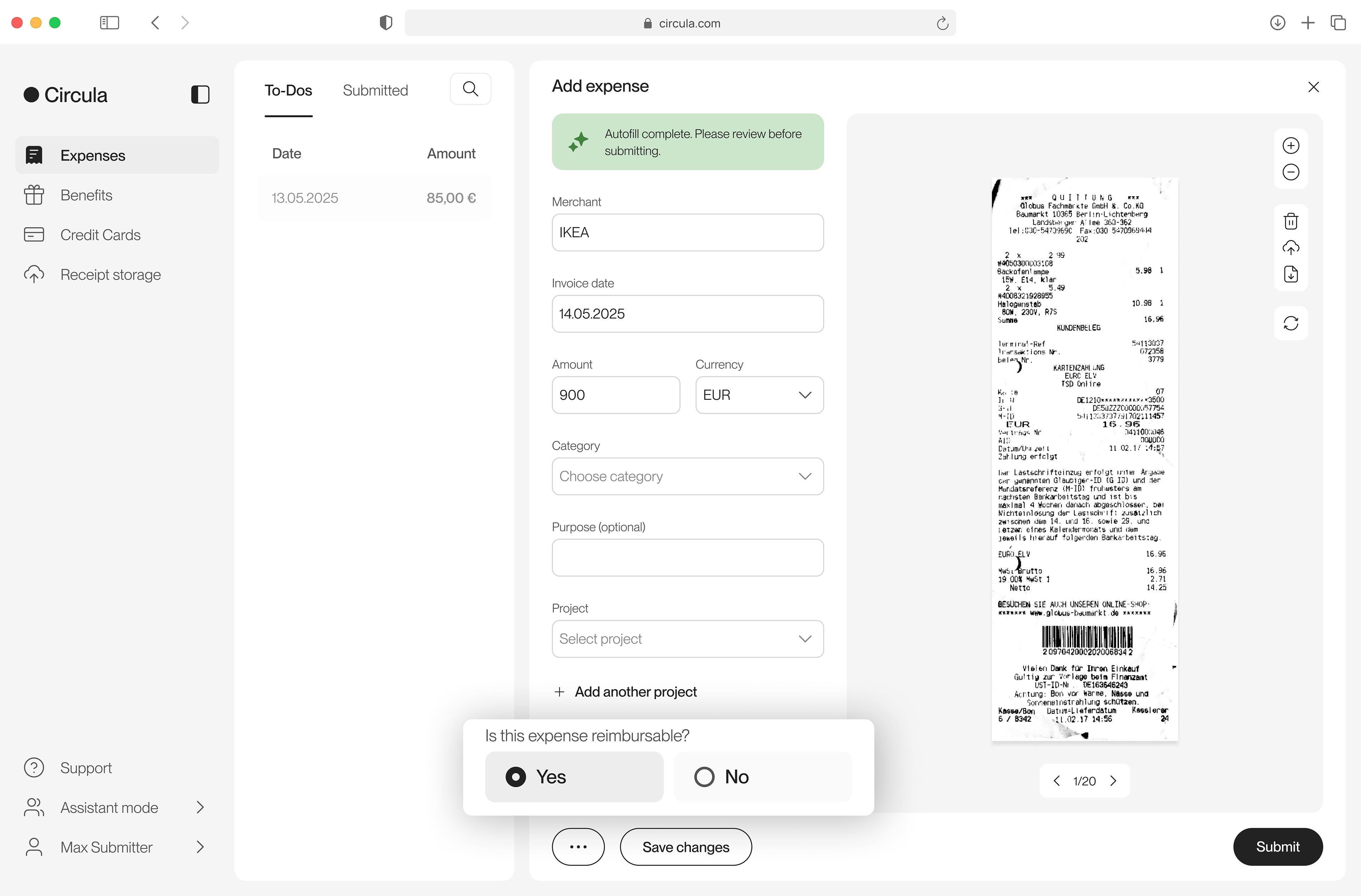
(New) Circula web app “Expense is reimbursable" field in submitter view
Track 2: binary choice rule
I created a design system guideline to help designers make design decisions in situations where a binary choice is required. Some example rules are:
● Switch when the change applies instantly or gives immediate visible feedback. The label states a condition, never a question.
● Switch when the change applies instantly or gives immediate visible feedback. The label states a condition, never a question.
● Checkbox for lightweight flags where unchecked is a safe default. Statement labels, positive wording.
● Yes/No radio for explicit, high-stakes decisions where an active "No" must differ from "not answered".
I deliberately did not retest settled industry conventions. Testing focused on what was specific to Circula: whether a form mixing checkboxes and radios stays easy to scan, and how our own screens behave. 6 of 8 submitters completed the mixed form without friction.
Track 3: read-only, disabled and static value pair
The disabled state was doing three jobs, so I defined clear boundaries:
● Read-only when the screen is still a form and only some fields are locked
● Disabled when an action could be available but isn't right now, always with a reason next to it
● Static value pair when the screen is in display mode and nothing should look editable
Deliver
My final delivery included three tracks:
● "Expense is reimbursable" field released as a Yes/No radio, with static value pairs on read-only views.
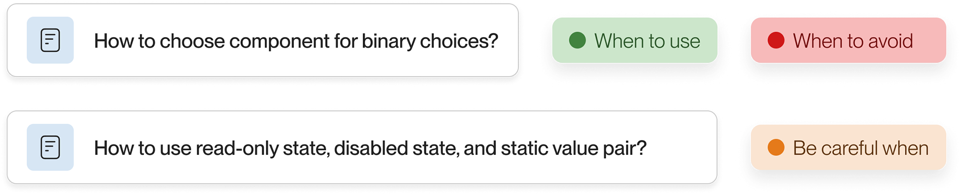
● Two guidelines published: "How to choose the right component for binary choices" and "How to use read-only state, disabled state, and static value pair?
● Read-only state added to the three components (Switch, Checkbox, and Radio) in the design system.
🎉 Impact: A customer passed on kudos through their account manager, saying this small UI change was a big improvement for their team.
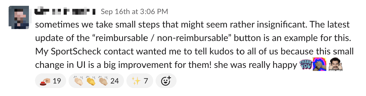
A kudos message from Circula's customer