Overview
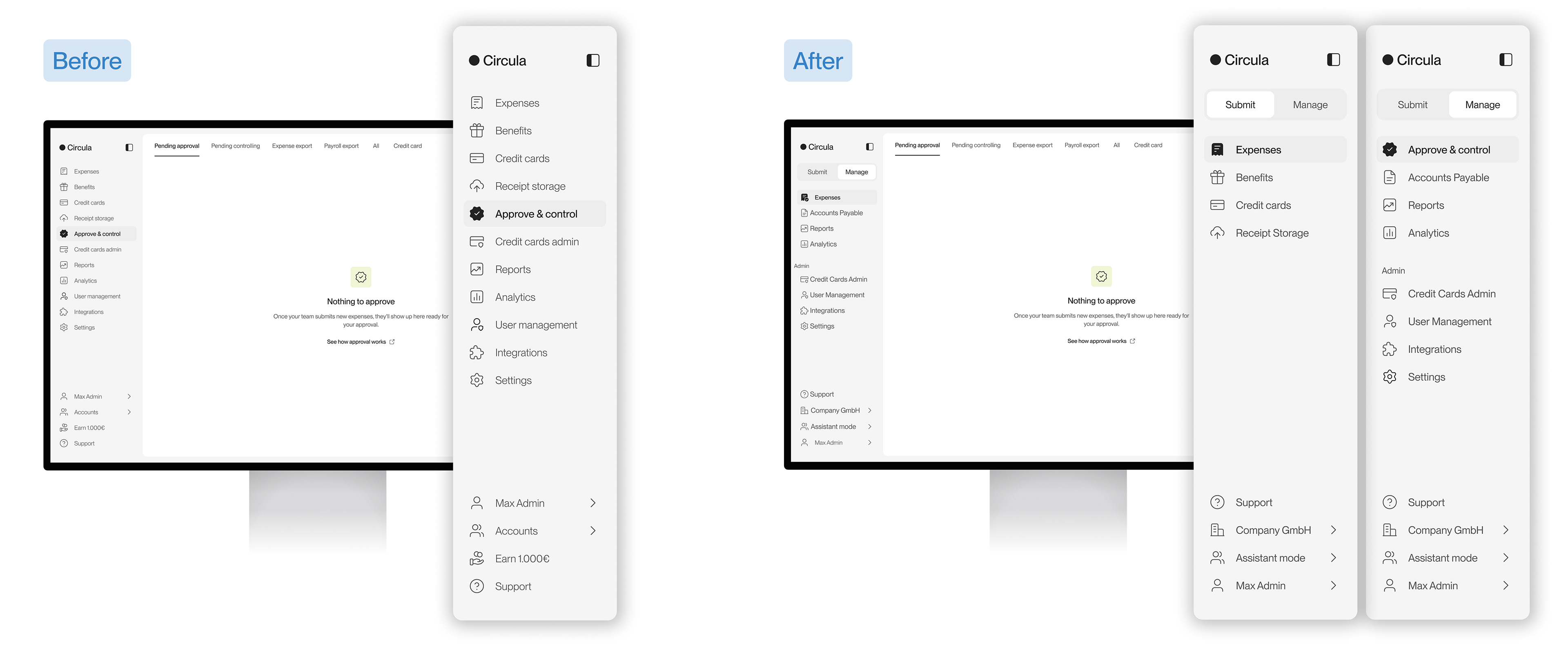
Circula's sidebar showed every tab a user had access to in one flat list. For users with several roles, personal and company tasks sat side by side without any grouping. I redesigned the navigation to separate personal work from company management, while keeping it simple for users who only submit expenses.
Discover: what makes the sidebar hard to use?
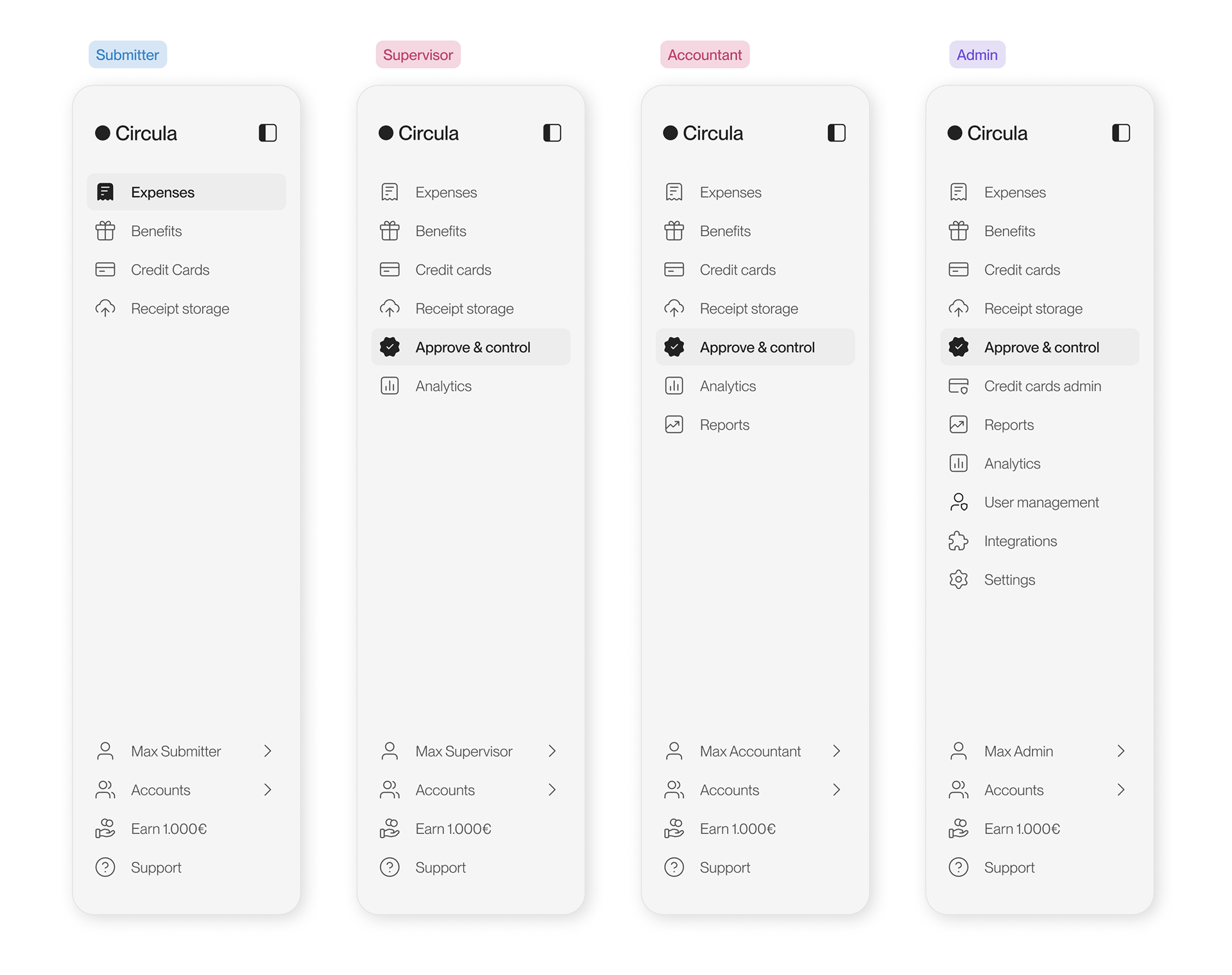
The first challenge was understanding where the navigation was breaking down. The number of tabs grows with each role. Submitters see only a few items, while supervisors, accountants, and admins gradually gain access to more functionality. For users with several roles, this resulted in a long list where very different types of work were mixed together.
I identified four main problems:
Clutter
Too many tabs appeared in one place, with little grouping or prioritization.
Mixed contexts
Personal tasks such as "Expenses" appeared next to company-level tasks such as "Approve & Control" and "User management."
Findability
Similar names could easily be confused, for example "Credit cards" and "Credit card admin".
Role confusion
Multi-role users could not easily focus on one area of work without navigating through everything else available to them.
From problems to principles
To understand how these problems affected different users, I mapped user journeys for five roles: submitter, supervisor, accountant, admin, and credit card admin. I looked at how often each role switched between menus to complete their daily tasks. Then I reviewed customer feedback from earlier usability testing to understand how users experienced the existing flat navigation. Finally, I benchmarked navigation patterns used in other products, comparing approaches such as section titles, dividers, segmented controls, and progressive disclosure.
The research suggested that the core problem was not simply "too many tabs". It was the lack of structure between different types of work. That led to two key questions:
1. How might we create a clearer distinction between personal and company work without making the sidebar more complicated?
2. And how might we create a structure that can continue to scale as new roles and features are added?
Define: goals and principles
Goals
I defined three goals for the redesign:
1. Reduce clutter for multi-role users while keeping navigation simple for single-role users
2. Clarify the boundary between personal and company work
3. Create a structure that can scale with new roles and features
Principles
These goals translated into two core design principles:
1. Clarity and findability
Users should be able to locate a tab without having to think about where it belongs.
Users should be able to locate a tab without having to think about where it belongs.
2. Scalability
The navigation pattern should continue to work as more roles and menus are introduced. There was also one important constraint: minimal disruption. Submitters are the largest user group, so users who only submit expenses should barely notice the redesign.
The navigation pattern should continue to work as more roles and menus are introduced. There was also one important constraint: minimal disruption. Submitters are the largest user group, so users who only submit expenses should barely notice the redesign.
With these principles in mind, I moved into exploration, comparing different ways of introducing structure without adding unnecessary complexity.
Develop a solution
Exploring the structure
I explored several navigation patterns to see how they could address the different needs of multi-role users. One of the main directions was a tab bar that switches between two contexts:
Submit — the user's own work
Manage — approvals, administration, and company settings
Manage — approvals, administration, and company settings
I also explored supporting patterns, including a utility menu for account actions, company switching, help, and logout, as well as a collapsed sidebar.
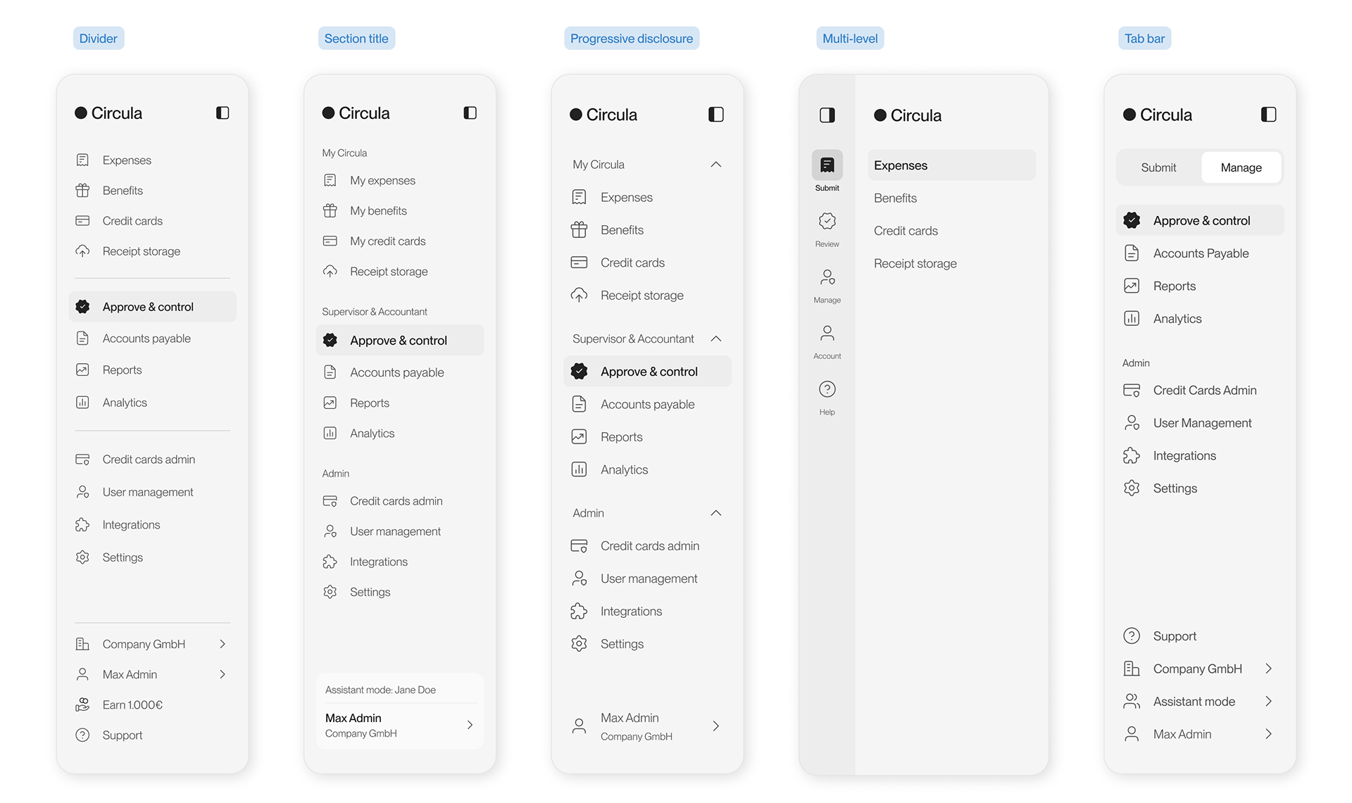
At this stage, the goal was not to find a polished final layout. It was to understand which structural pattern could create the clearest separation while remaining flexible enough for the future.
Critique rounds
I shared the concepts in three critique rounds with the design and engineering teams. Two patterns received the strongest feedback: tab bar and progressive disclosure. The cascading utility menu was also well received. I chose the tab bar because it created a clearer separation between personal and company tasks without simply hiding information. It also left room for additional navigation items as the product grows.
After another round of iteration, I took the tab bar direction into user testing.
Validate
Testing the concept
The next step was to see whether the structure that made sense internally also made sense to users. I used a combination of qualitative and task-based testing:
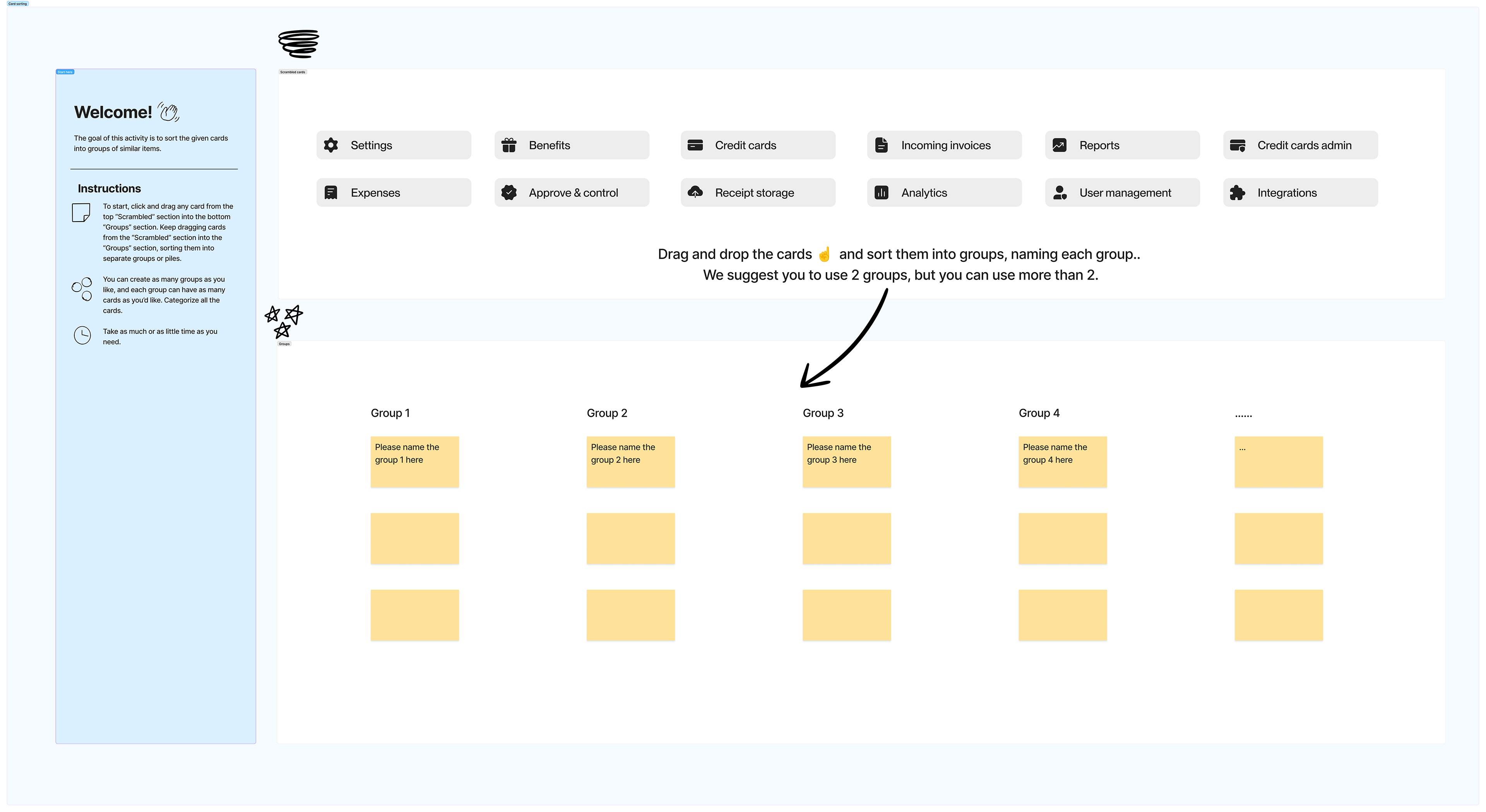
1. Card sorting and 12 user interviews across roles to understand how users grouped and interpreted the menus
2. Unmoderated task-based tests on Userbrain (an online testing platform) with 6 testers
What worked
The core navigation structure performed well on key tasks.
✔️ 6/6 participants found where to approve expenses and add colleagues.
✔️ 5/6 found where to submit expenses and switch entities.
✔️ 5/6 found where to submit expenses and switch entities.
✔️ Among supervisors, 4/6 preferred having separate Submit and Manage areas because they mostly used the product to submit their own expenses.
✔️ Participants also described the resulting layout as shorter, logical, and minimal.
👉 These results supported the underlying idea: separating contexts could reduce the feeling of navigation overload without requiring users to learn a completely new information architecture.
What didn't
The testing also revealed issues with some of the supporting interactions.
❌ The collapsed sidebar caused confusion. Four of the twelve interview participants did not understand the switch icon, while two could not find how to reopen the sidebar.
❌ The placement of "Help" also created a discoverability problem: 3/6 task-test participants could not find it in the utility menu.
❌ I also explored using color to visually distinguish the two modes, but reactions were mixed. Several participants disliked such a dramatic visual change.
👉 These findings helped separate the concept from the details: the overall structure was working, but several interaction and visual decisions needed to be reconsidered.
Decide
Turning findings into design decisions
Rather than treating the test results as a reason to abandon the concept, I used them to refine where the new pattern should and should not appear.
The tab bar became conditional.
Only users with more than the submitter role see the Submit / Manage switch. Submitter-only users keep the existing single sidebar, reducing unnecessary change for the largest user group.
Only users with more than the submitter role see the Submit / Manage switch. Submitter-only users keep the existing single sidebar, reducing unnecessary change for the largest user group.
The color switch was removed.
The two modes remained structurally distinct, but the visual design stayed within the rebranded palette instead of introducing a dramatic color change.
The two modes remained structurally distinct, but the visual design stayed within the rebranded palette instead of introducing a dramatic color change.
"Help" moved back into the sidebar.
Because it was difficult to discover inside the utility menu, Help returned as a visible item at the bottom of the sidebar.
Because it was difficult to discover inside the utility menu, Help returned as a visible item at the bottom of the sidebar.
The collapsed-sidebar interaction was refined.
Instead of introducing a new icon to solve the switch problem, I improved the interaction behavior. The prototype did not include the hover tooltips available in the live product, so the final solution took those real-product interactions into account.
At this point, the navigation model was established. The remaining work was to translate it into a robust system that could work across different roles, screen sizes, and product states.
Deliver
Interaction behaviours
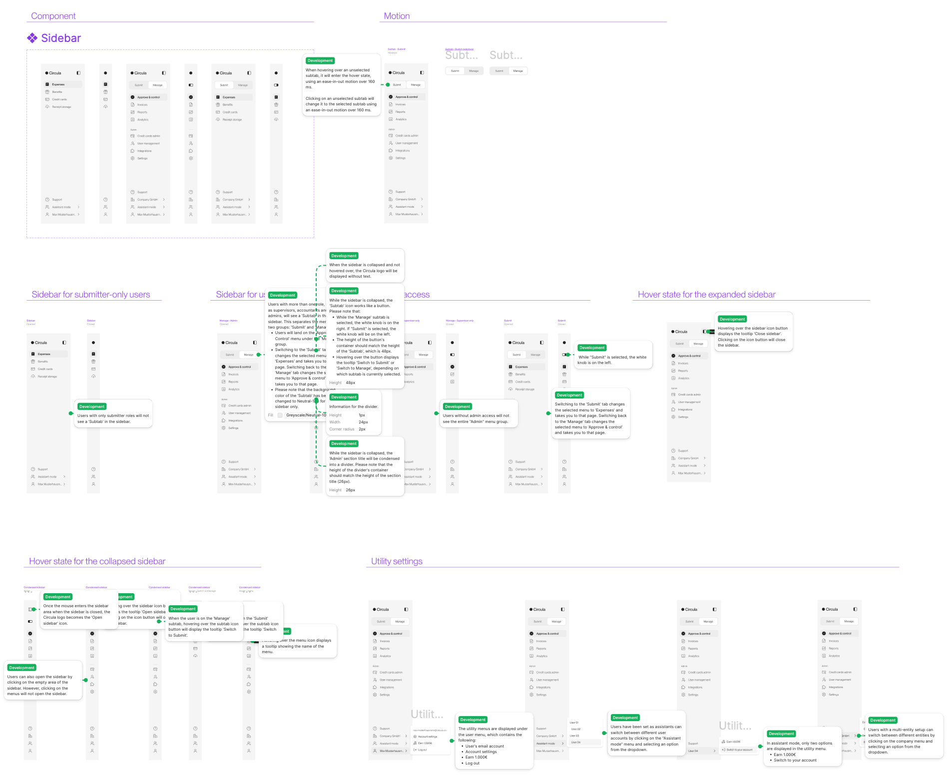
The final design introduced several behaviors to make the new structure easier to understand in everyday use. Here are some examples:
⏺ When the sidebar is collapsed, tooltips reveal the menu name on hover, preserving findability without taking up additional space.
⏺ The logo changes based on pointer position in the collapsed state, providing an interaction cue for reopening the sidebar.
⏺ The sidebar collapses automatically below certain screen widths to adapt to smaller layouts.
These details helped maintain the simplicity of the final structure without requiring additional controls or persistent UI.
Handover
I delivered final designs for:
⏺ Submitter-only and multi-role sidebars
⏺ Expanded and collapsed states
⏺ Hover states and motion behaviour
⏺ Utility menu interactions
⏺ References applied across key screens for engineering
During development and QA, I reviewed builds and helped resolve edge cases, including sidebar behaviour on cascading pages.
Outcome
The redesigned sidebar was ultimately released to all users. It addressed a growing navigation problem without turning it into a larger navigation system.
Instead of giving every user the same increasingly complex sidebar, the final solution introduced structure only where users needed it: multi-role users gained a clear distinction between Submit and Manage, while submitter-only users continued to use a simple single sidebar.
More importantly, the process showed that the solution was not just about reducing the number of visible items. The key was creating a navigation model that reflected the different contexts in which people use Circula — and then validating that model before committing to the final interaction details.