Overview
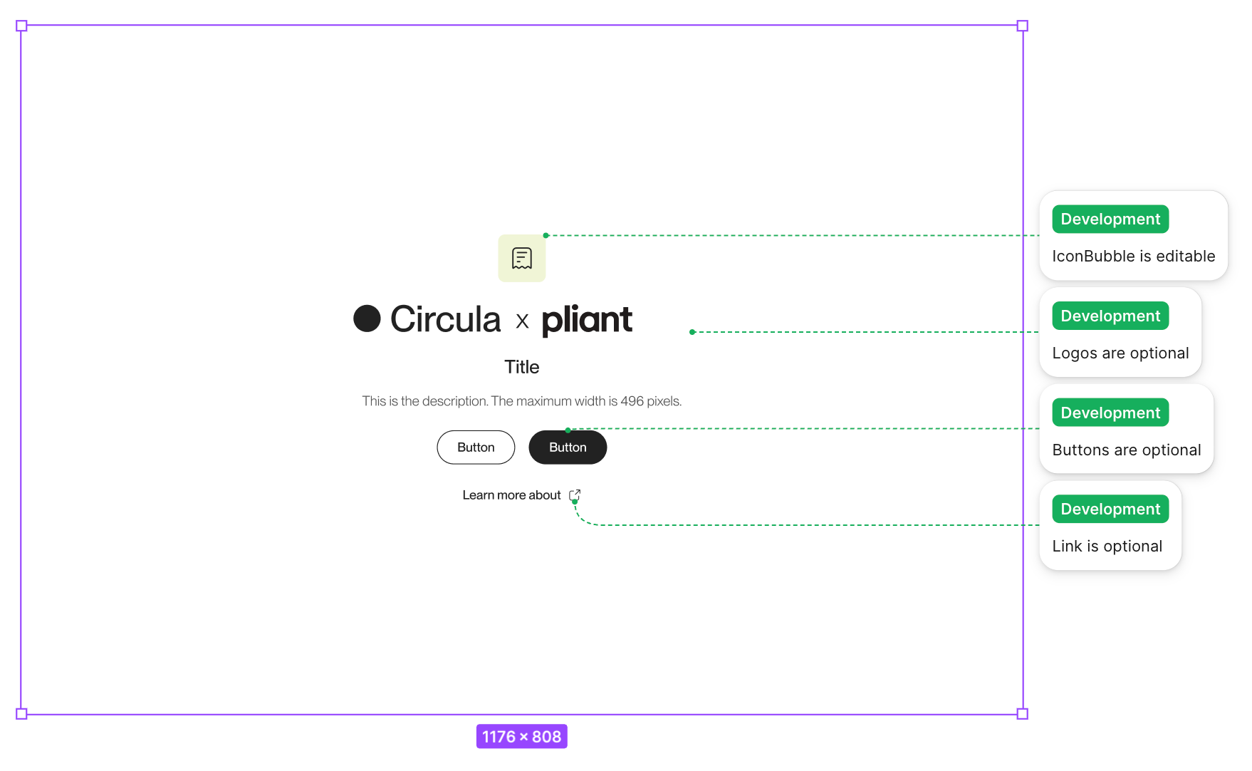
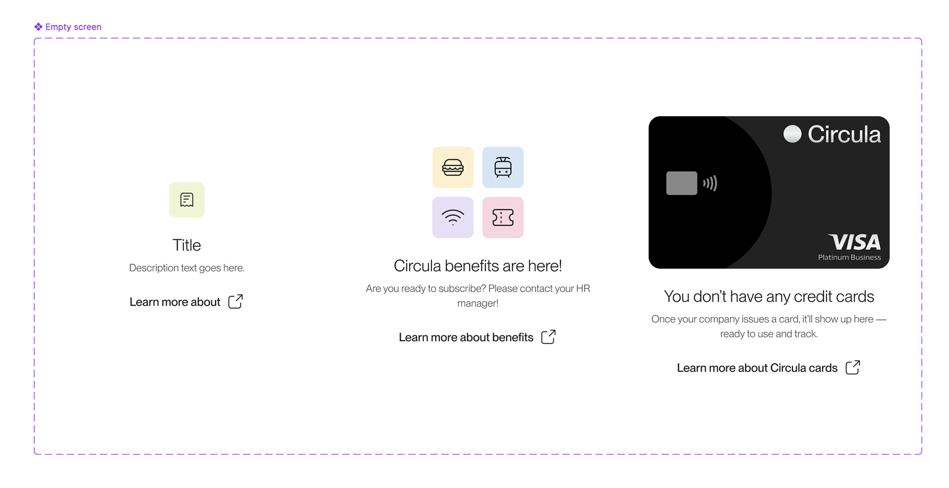
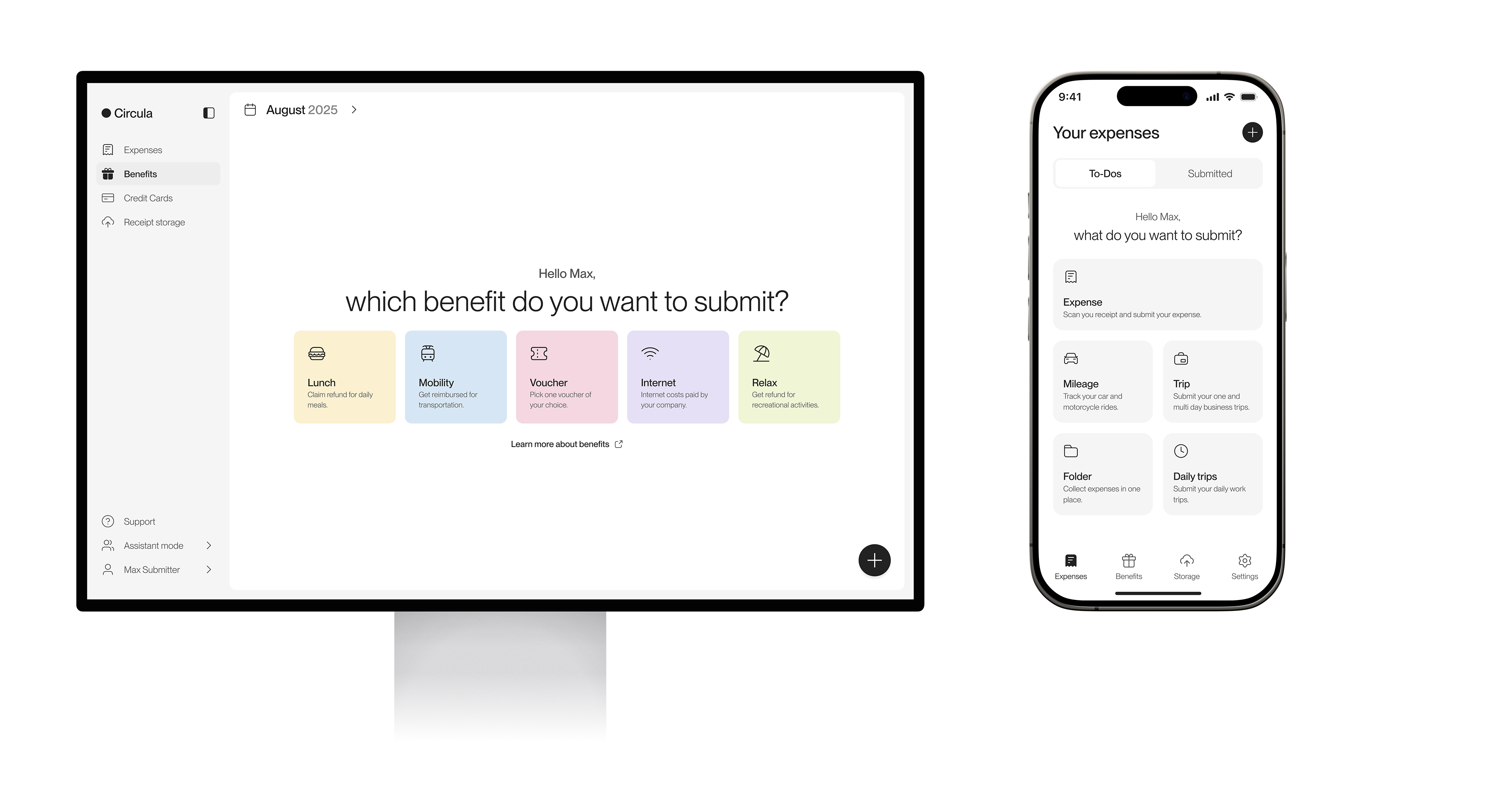
Empty states are often the first thing a new user sees in Circula, and the moment where they decide what to do next. With the rebranding, I redefined them across the web and mobile product so they help people start their task instead of just filling space.
Design principles
Lead to the action, not the illustration
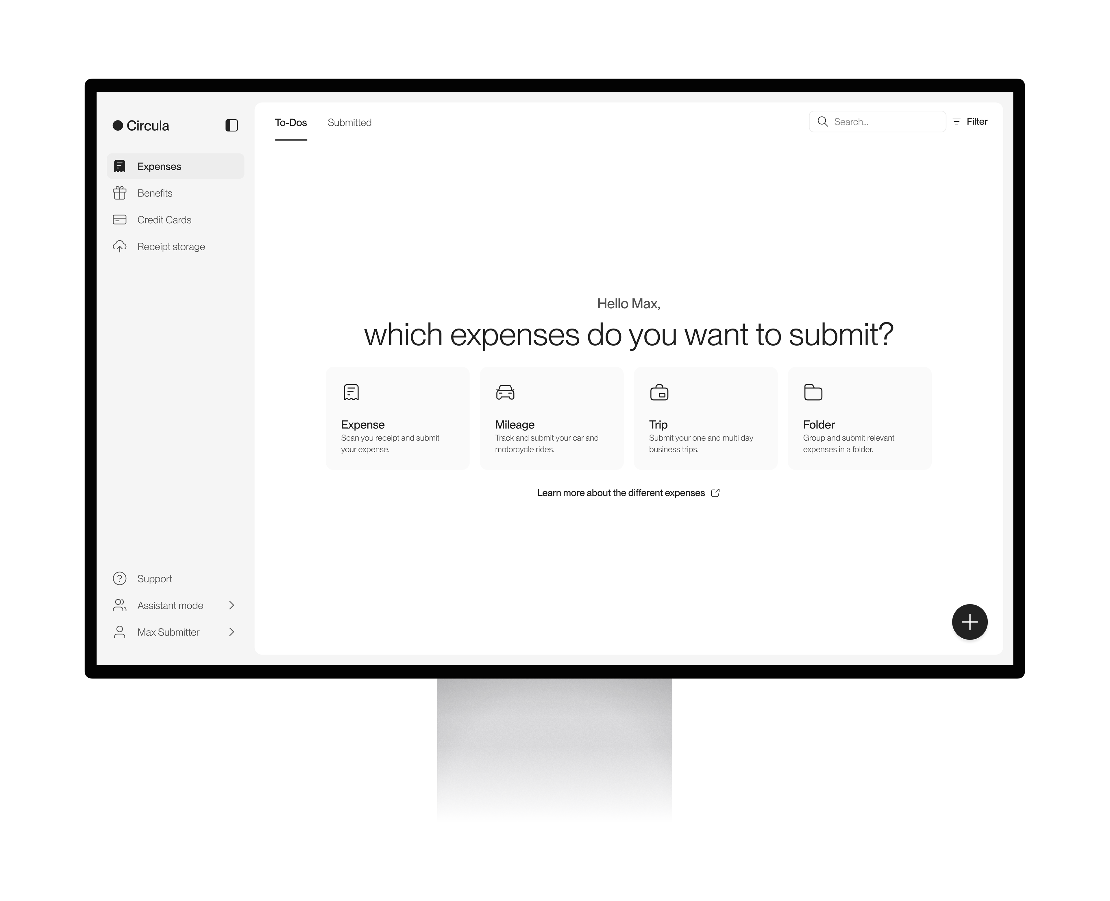
An empty page is a starting point. Give users quick access to the action they came for, and remove anything that competes with it. In Expenses, for example, the empty state asks "What do you want to submit?" and offers the submission types directly, instead of a picture and a single button.
Keep it simple, keep it task-oriented
Balance a calm, minimal UI with a layout built around the task. Every element earns its place by helping the user move forward.
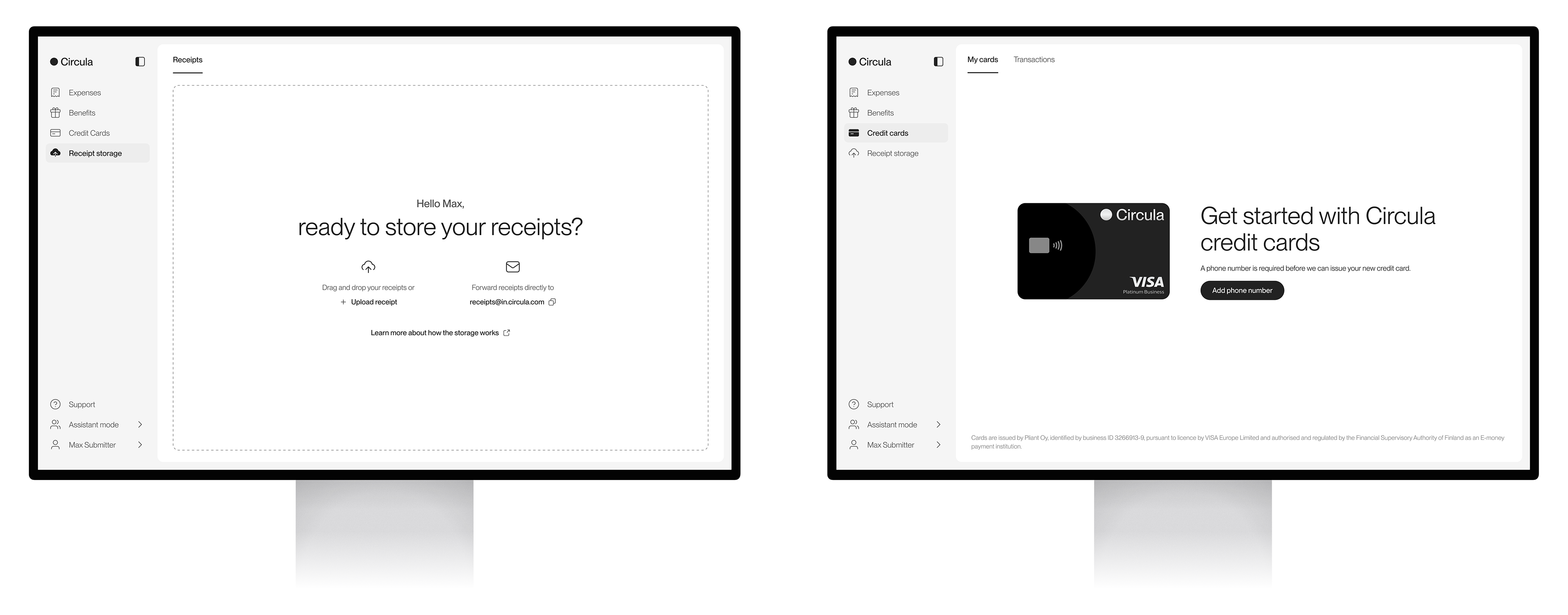
The right information at the right time
Explain only what the user needs in that moment: why the page is empty and what happens next. Detail belongs in the flow, not in the empty state.
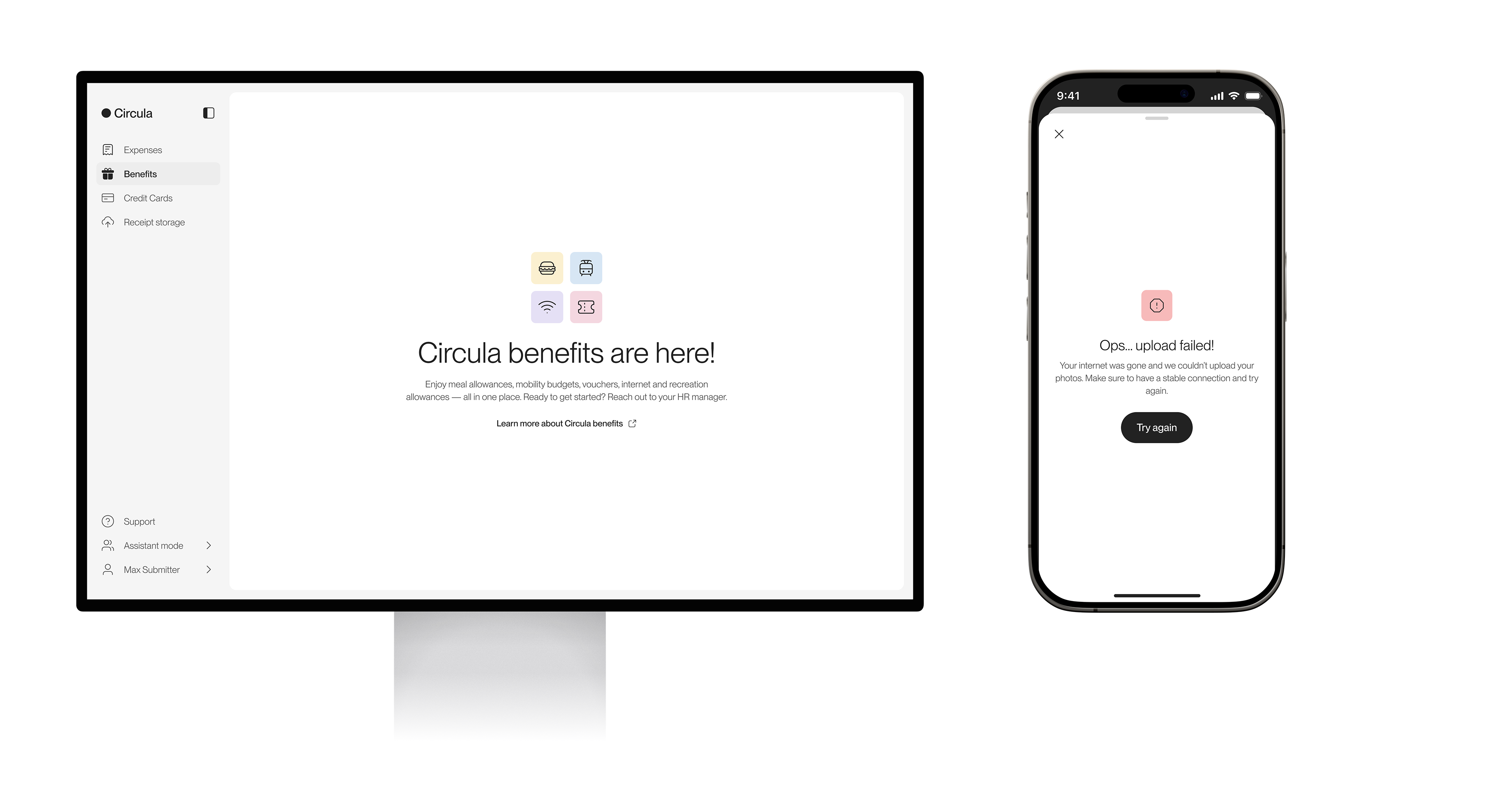
Clear over clever
Short headlines, plain language and one obvious next step. Users should understand the page in a glance, whether it's their first visit, a filter with no results, or an error.
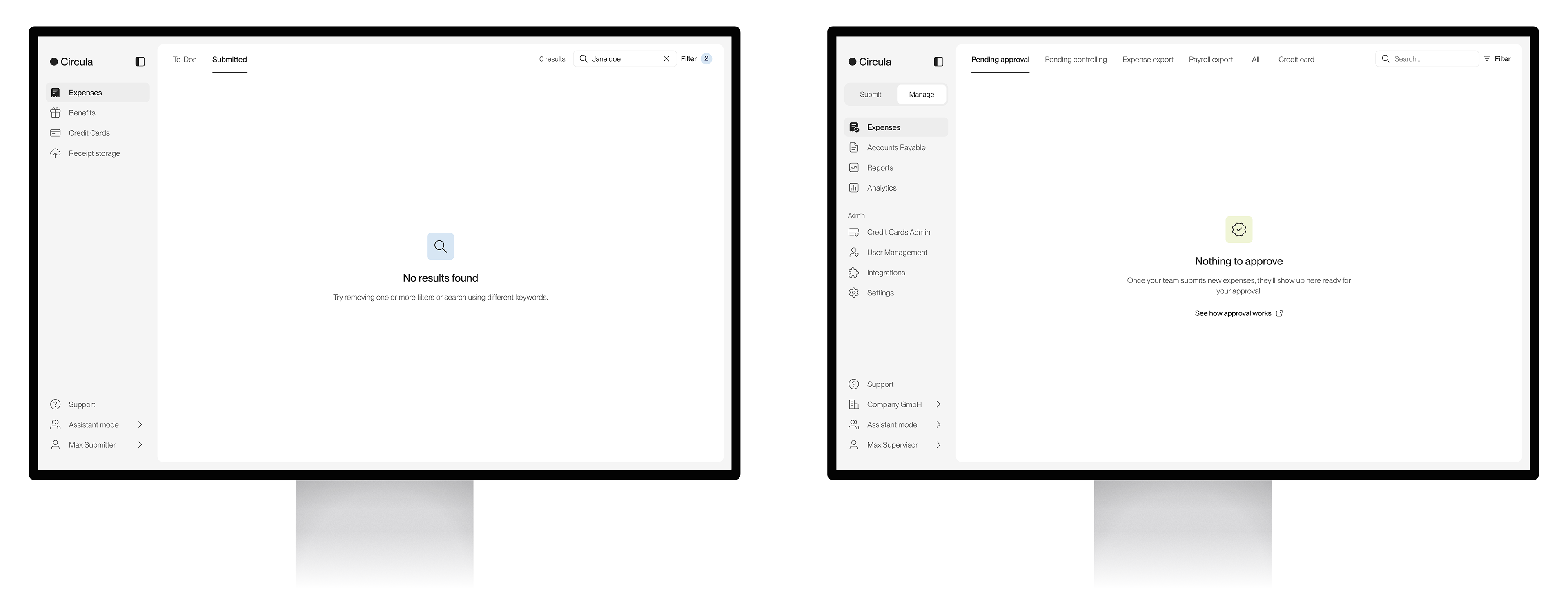
What I delivered
⏺ Design principles for empty states in Circula
⏺ All empty state screens (70+ empty states across 3 platforms) and behaviours defined across the web and mobile product, including responsive breakpoints
⏺ Foundations in the Lunar design system: guideline, anatomy and components for empty states